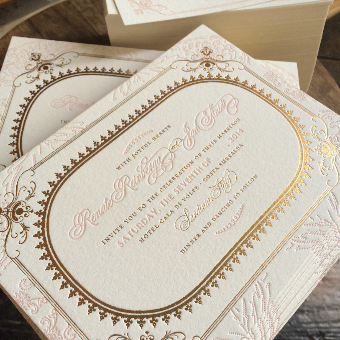
Ben and I have been daydreaming of visiting Italy for so long now. Earlier this year we were planning a trip there for this fall, but I fell ill, had surgery, and our great Italian adventure was shelved. Designing this invitation suite for Renate and Jad was like a lovely little consolation prize that gave me a small connection to coastal Italy—which we fully intend to visit, maybe next year. I even got carried away making a Bella Italia wedding inspiration board on the Lucky Luxe Pinterest. Can you imagine what a resplendent celebration this will be? Renate chose letterpress in bright blush pink paired with gold foil on our double thick Crane Lettra paper with gold edging. I would just love to be a guest for their beautiful wedding weekend! Do you think we should add this design to our Collection?
Uncategorized
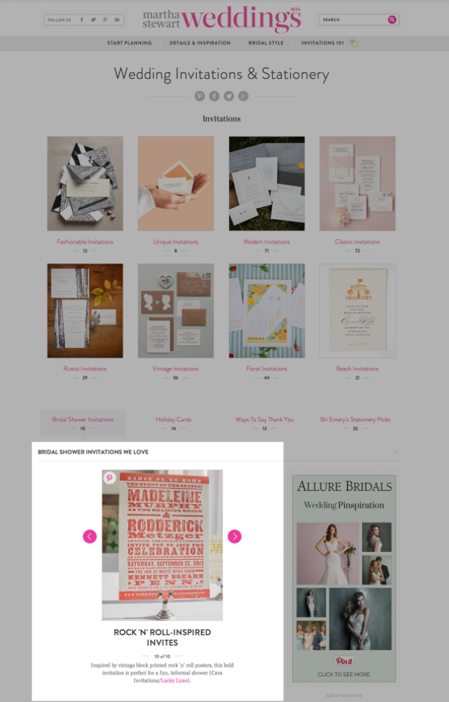
Cara is featured on MarthaStewartWeddings.com
We’ve been included in Martha Stewart Weddings’ curated collection of favorite invitations. They’d like to see Cara used for a fun, informal bridal shower invite. I bet they’d play music by Nouvelle Vague and The Cure at that shower. I hope so, at least.
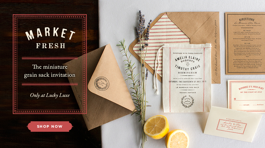
Market is finally here!
Back in January I was getting the feeling that it was time for something new. That’s thing about being an artist for a living—once you begin to feel like your work is stagnant, it’s maddening. I started obsessing over it. What could be the next thing? I made notes throughout my days. Sauce and I had an hour long conversation one morning discussing this watercolor trend, the copycatters trying to get on Anna Bond’s genius quirky floral Rifle Paper wagon, the suddenly oversaturated art deco market with designs popping up in every stationery shop. We threw around the idea of a design with a rainbow roll, but that’s being done more and more. I designed Toile, and felt so excited about it, but it still didn’t feel like the ‘EUREKA!’ idea we’ve been trying so hard to create. The hankies put us on the map back in 2009, and the copycatters followed suit. What could we do that hasn’t been done? Something like the hankies? I felt so discouraged after weeks of brainstorming. One Sunday afternoon, I snuggled down into my bed for a nap in hopes it would clear my mind.
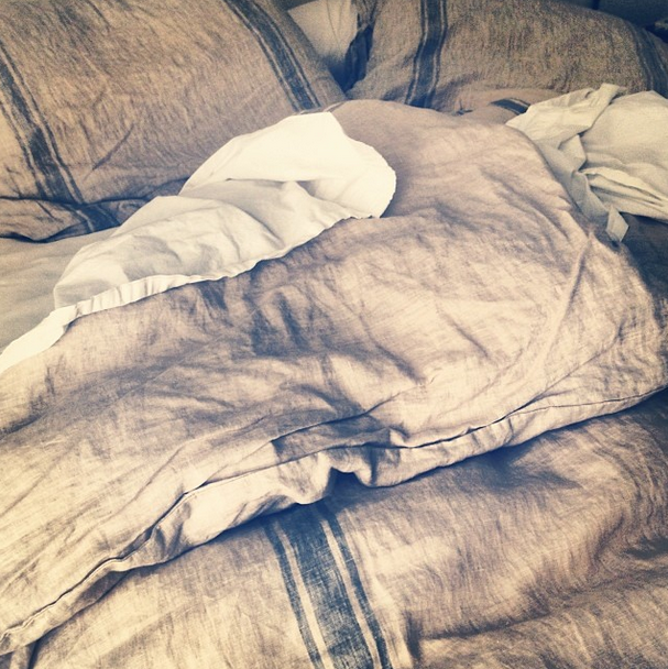
Out of the blue, the idea came to me. I love this duvet. It’s so soft and cozy. I love linen. The way it looks like an old French grain sack.
And the seeds for Market were planted. I subscribe to Country Living magazine. I see so many houses that, like mine, are filled with comfortable French-inspired textures.
I jumped out of the bed and rushed to the studio to get busy designing. By midnight, the design for Market was complete and production was in motion. And now, I’m so very excited to introduce it to y’all. If I could marry Ben all over again, this is the invitation I would’ve designed for us. I hope you’ll love it, too. You can also click here to see our Pinterest board inspired by Market!
Rose gold and silver foil are here!
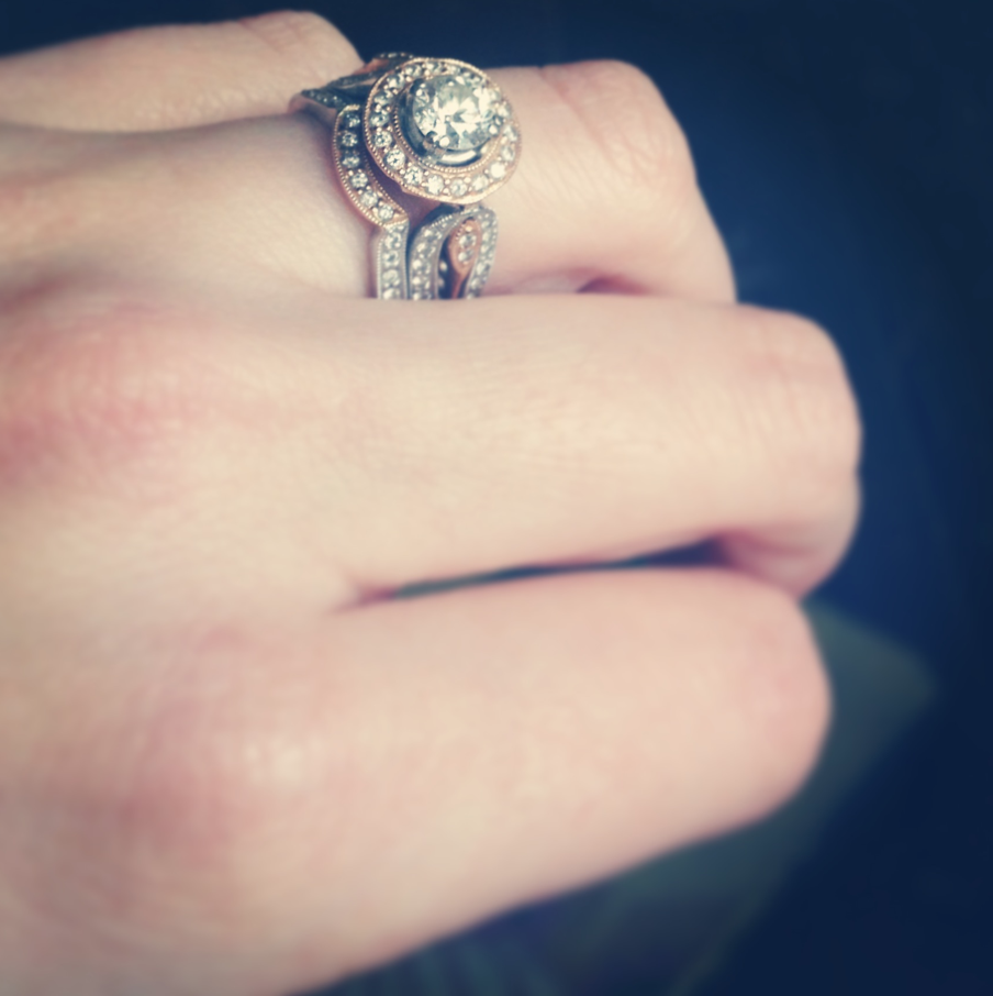
So about a million years ago, way back in 2007, Big Ben proposed to me on the balcony of Square Books in Oxford, Mississippi—the home of our alma mater, Ole Miss. And after he took a knee and proposed using the very words that my grandfather spoke when he proposed to my grandmother so many years ago, he gave me the rose gold antique-inspired engagement ring I had been dreaming about since about a month after we started dating (hey! when you know, you know).
http://www.youtube.com/watch?v=UhI_O1Lpn4s#t=276
(You can skip to the 1:40 mark to get to the good stuff and click here to read the story behind that book I was reading.)
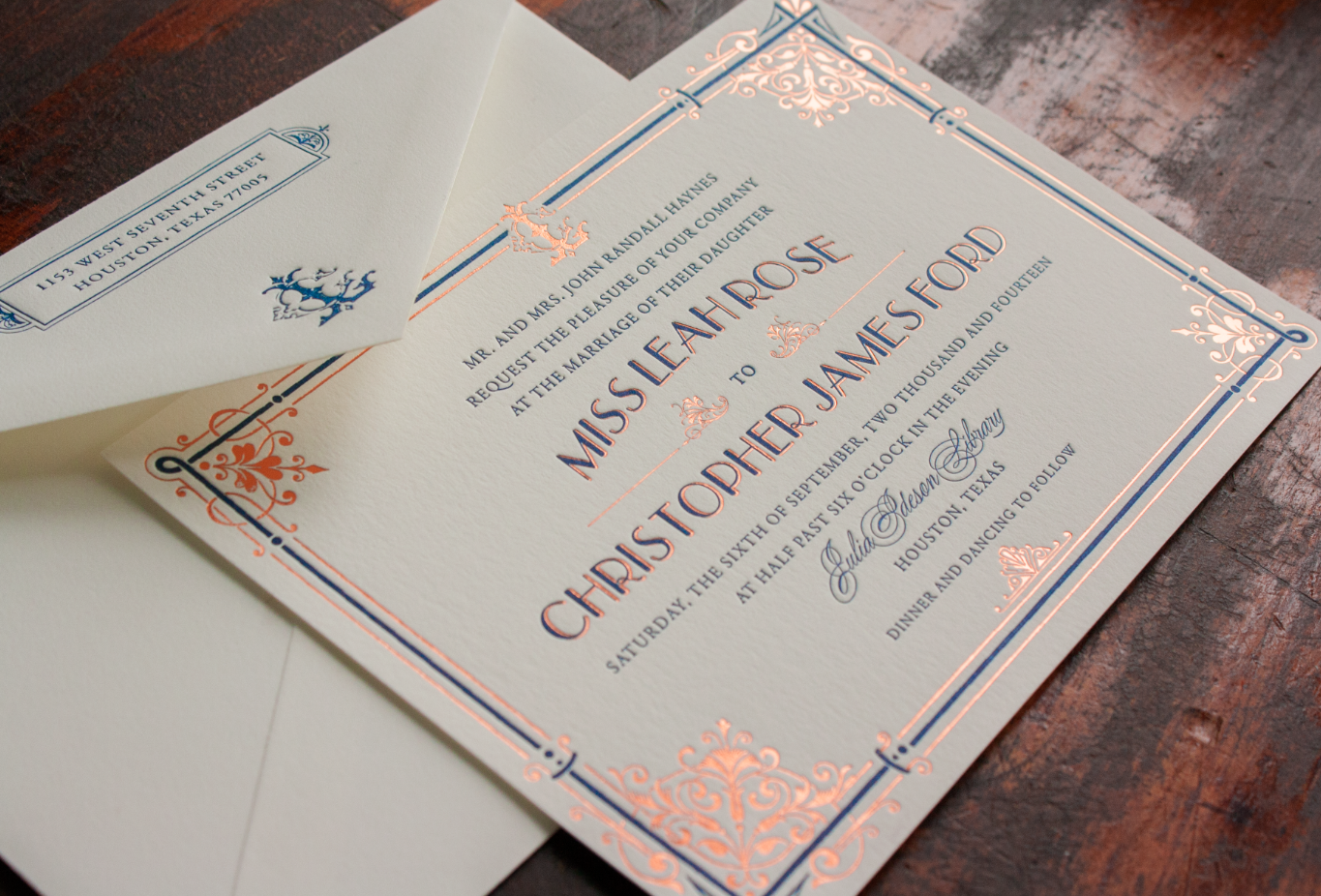
I’ve never stopped loving rose gold and I’m so happy to see that it’s still sticking around the fashion world after all these years. I honestly think it will always be lovely and in style, which is why I was really excited to get a commission for the Austen invitation in navy ink and rose gold foil for a summer magazine release. SO, all of this is to say—in a day or so, rose gold and silver foil will be 2 new upgrade options joining gold foil in the Lucky Luxe color palette and I’m really happy and stupidly sentimental about that. Here’s a little preview Austen and Boudoir in our newest foils:
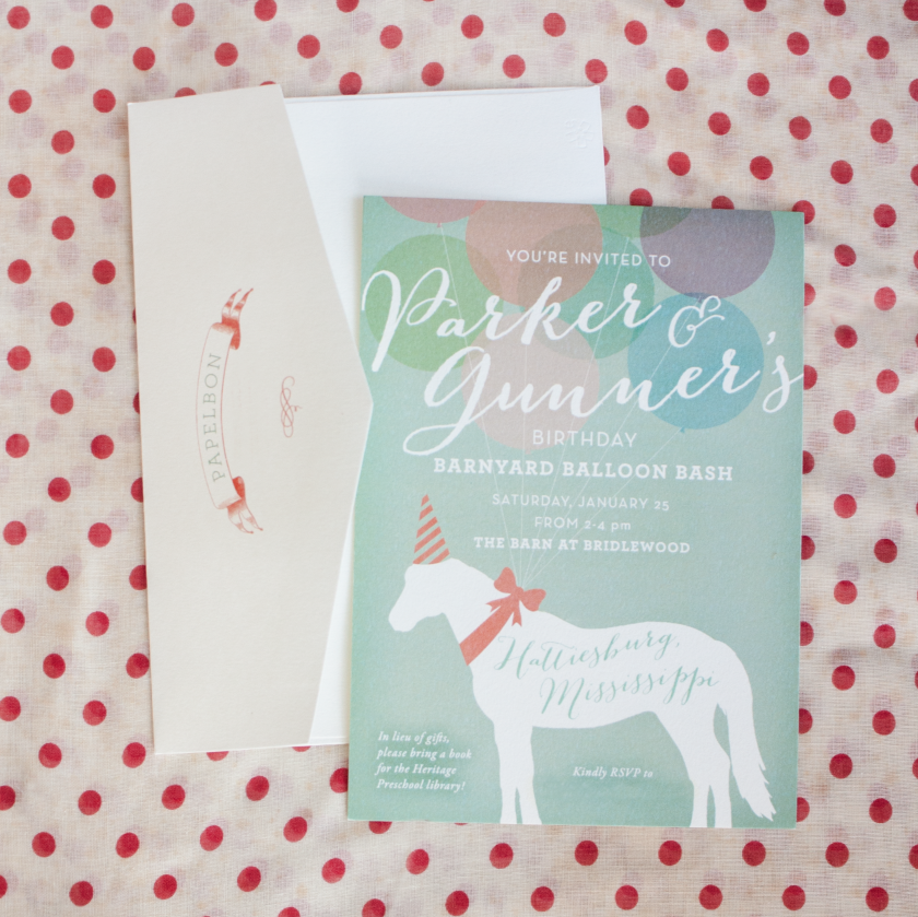
Papelbon birthday sneak peek!
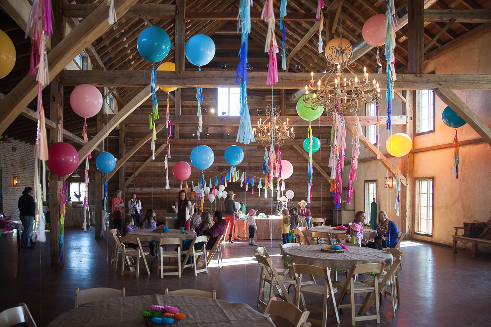
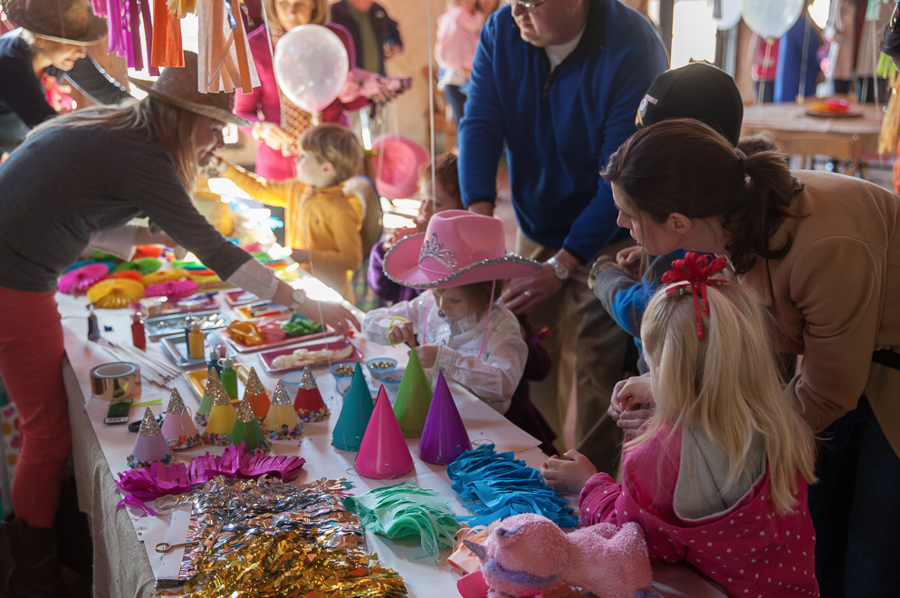
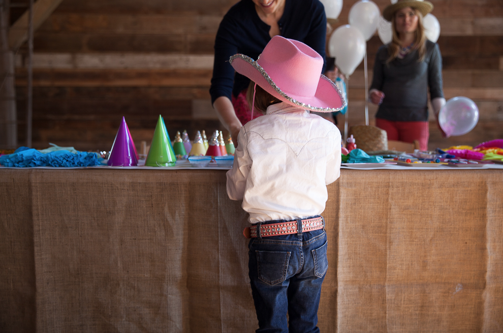
We’ve had the opportunity to work with MLB closer Jonathan Papelbon’s family on a few projects over the years and so love his wife Ashley’s willingness to let us be creative with her ideas. One of our first projects together were the sweet baby announcements for their first daughter, Parker. Parker is growing up so fast and now has a baby brother, Gunner. Even though Jonathan is playing for the Phillies now, Hattiesburg, Mississippi, just a few miles down the road from our studio is where they call home. Ashley contacted us again to commission an invitation for Parker and Gunner’s joint balloon birthday party at a barn venue here in Mississippi, so we had fun with lots of colors inspired by the Geronimo Balloons that were being used for the birthday party. It was fun to get kiddish and colorful!
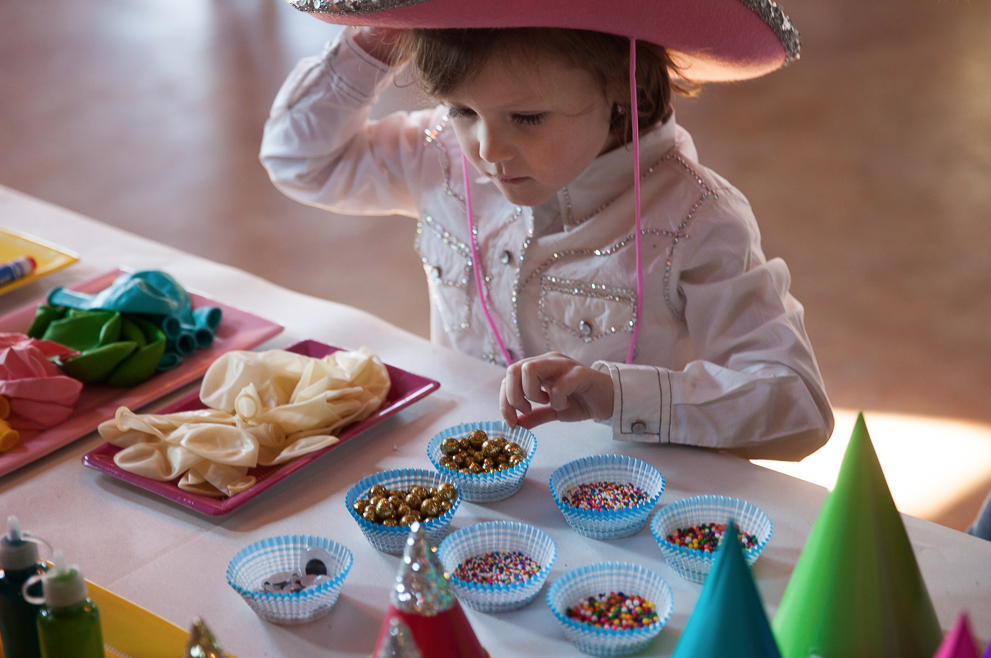
Here are a few photos by Sam McAlister of the coolest kids’ birthday party ever:
Oh to be little and in love with balloons!
FREE Custom Design in January & February
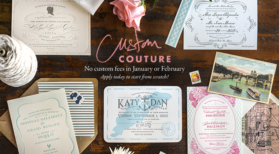
Pssssst! Did you know that for January and February our custom fees are waived?
What does that mean, you might be asking?
Why, it means that you can apply to have a from-scratch custom design, made just for your wedding, at the same cost as our collection (click here to see collection pricing). No custom fees!
We can only take on so many custom clients per season, so the earlier you apply, the better. We base custom designs on your own inspiration images of design + fonts + color + whatever you love, and the more descriptive the pins on your wedding Pinterest boards are, the better. Visit our custom page (https://lucky-luxe.com/custom/) and apply before February runs out so you don’t miss the boat!
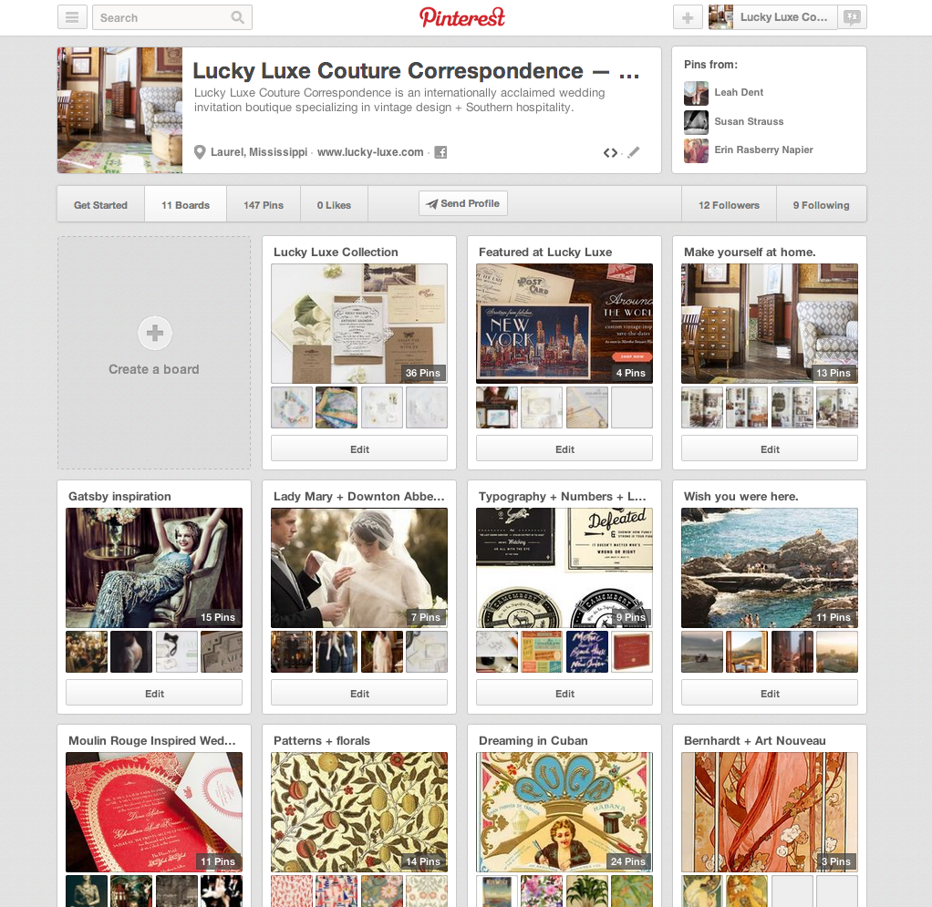
Lucky Luxe on Pinterest & Instagram
New Year, More Luxe
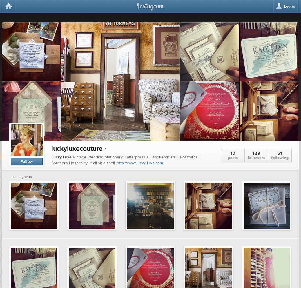
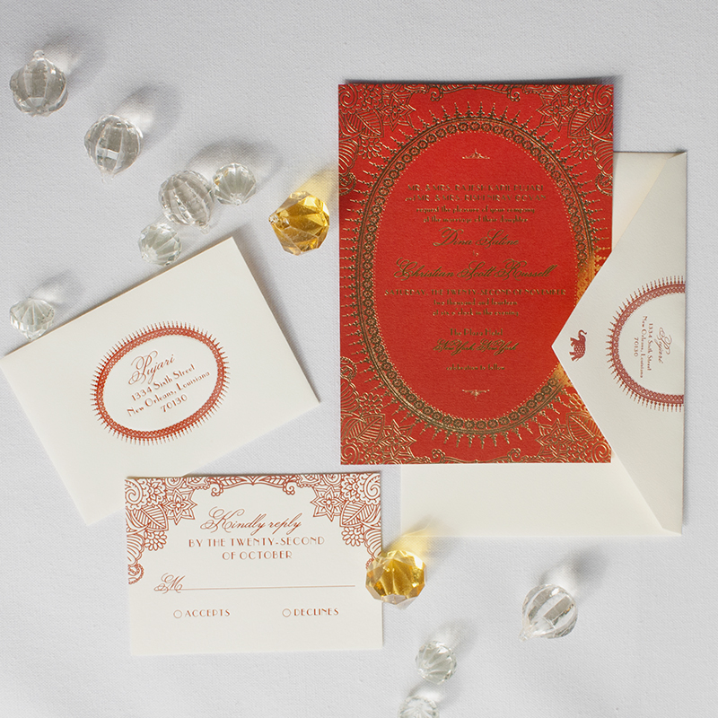
We’re really excited that it’s finally 2014 so we can show you all the pretty new paper we’ve been working so hard on! First up, Spectacular Spectacular—our Indian + Moulin Rouge-inspired invitation suite:
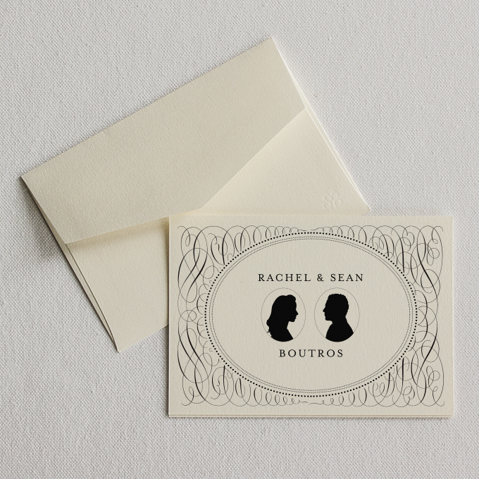
And we’ve finally created a brand new collection of affordable flatprint custom personal stationery that coordinates with our wedding collection! My favorite is Heirloom, with sweet custom cameos:
And in a few days, we’ll be adding boxed notecard sets in gold foil that match our beloved Gatsby invitation.
Happy new year, friends. We’re so excited you’re here!
Alexandra & Eric
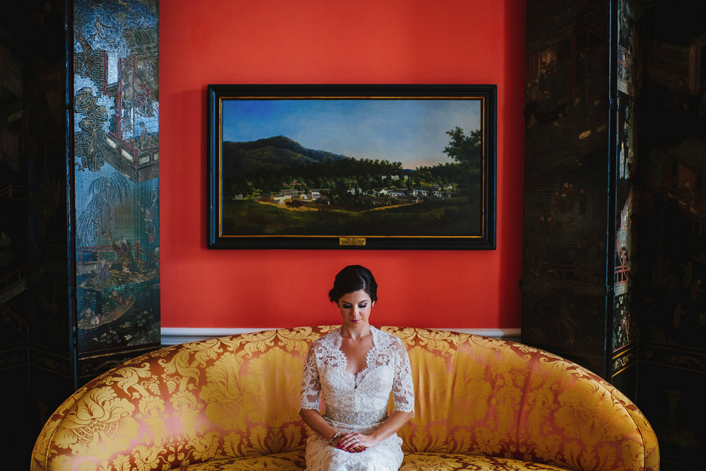
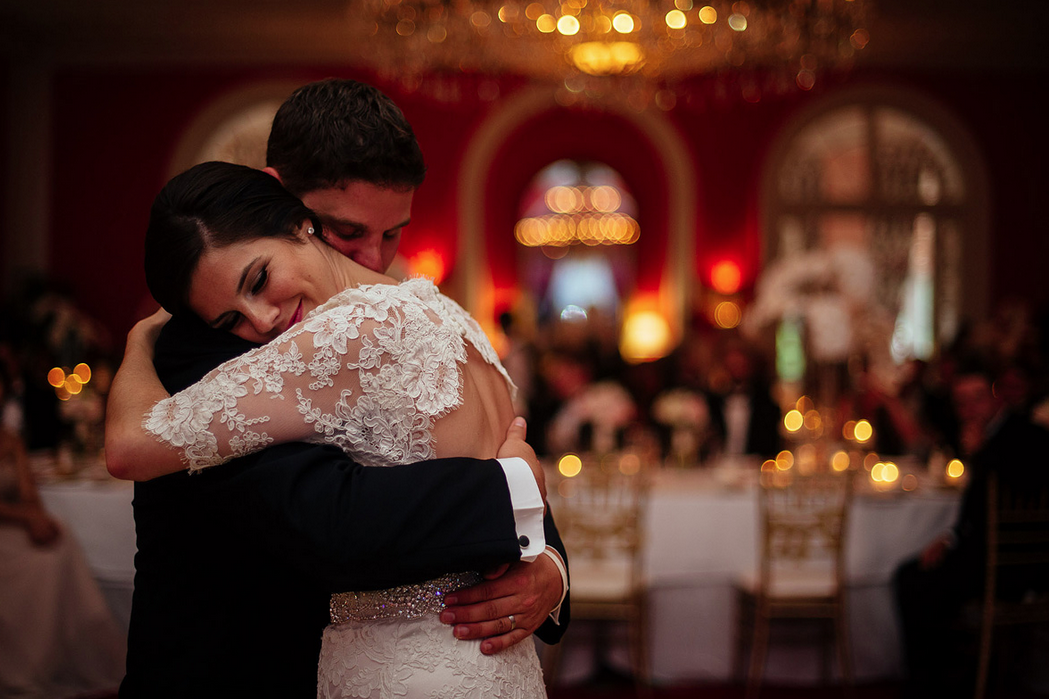
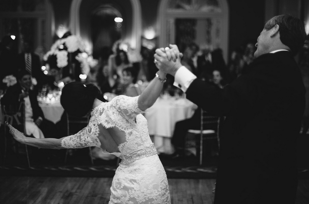
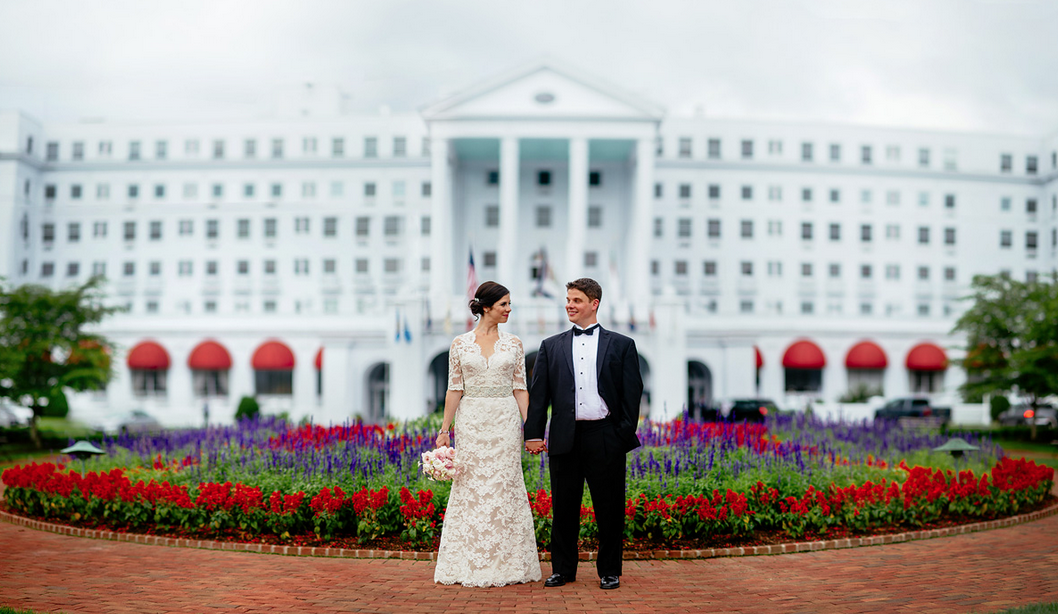
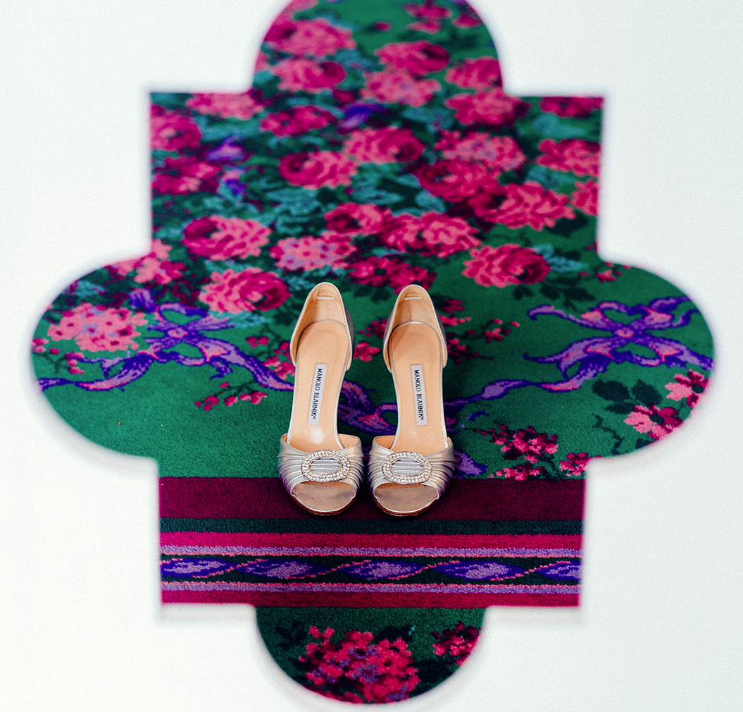
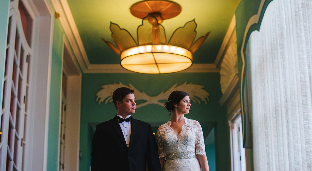
I just received some gorgeous wedding photos by The Oberports from a couple we got to work with earlier this year and I had to show y’all. Alexandra’s dress is absolutely the prettiest I’ve ever seen and if I could get a do-over on my own gown, I would choose this one hands down.
Don’t they look so in love?
This is the part of the wedding process I have so little interaction with that it feels really good to see a couple on their day, the day their two families became one. I feel like I know them a little bit from these images. Happy day!
Venue: Greenbrier Resort, White Sulphur Springs, WV
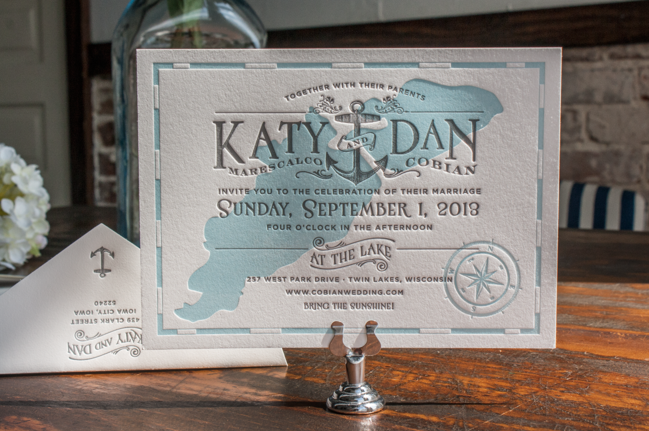
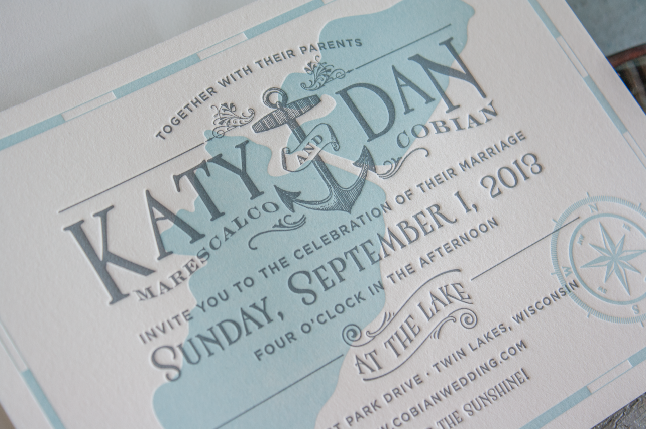
A Twin Lakes Wedding
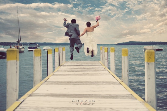
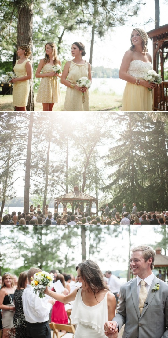
Katy and Dan contacted us a couple months ago with a request for a whimsical Bespoke invitation for their lakeside Wisconsin wedding. I went crazy with faux bois and pine tree icons, then she decided to go a lighter, sparkling, summery nautical direction and my entire thought process shifted. I was looking at these kinds of images for inspiration on her Pinterest board, and I got carried away:
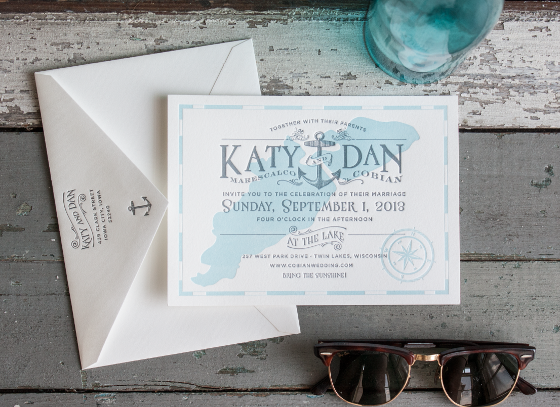
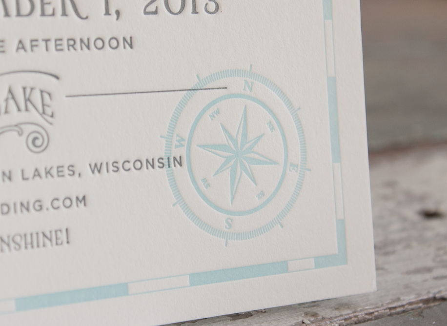
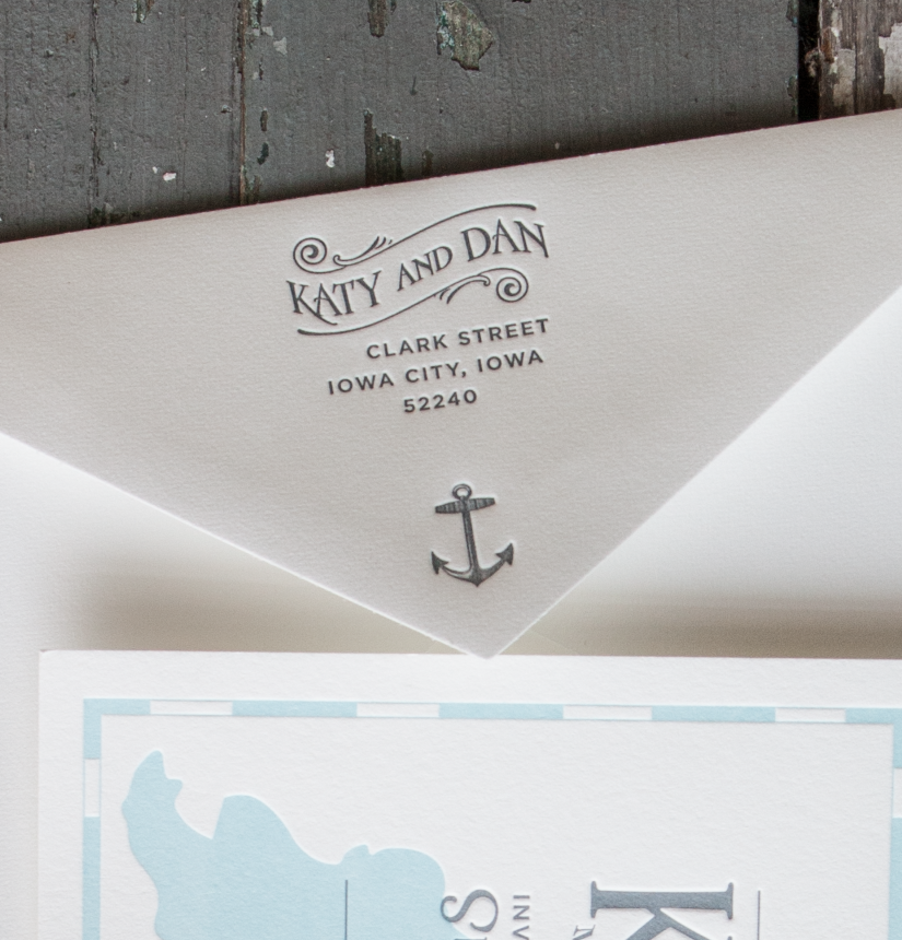
And this is the invitation that rolled off the press today:
I’m so proud of Katy for choosing the concept that was less traditional—I gave her some much simpler options to choose from, but she went with what I call the ‘sea captain’ design. I absolutely love the layering of colors.

