Boston with a punch of pink

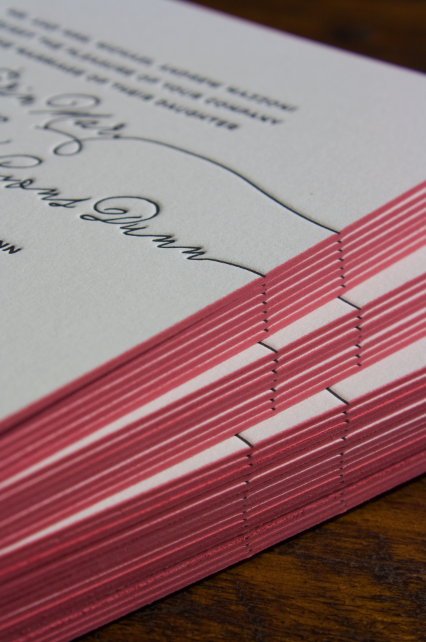
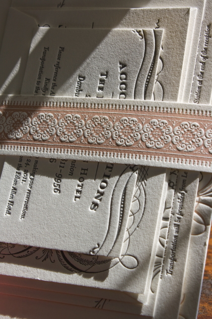
In case you’re considering the added expense of edge painting on your invitations, I think you need to see our first-ever hot pink edge painting on a Boston suite in double-thick Crane Lettra. We love a punch of color in unexpected places—especially on a black and white invitation!

Ilene & Larry

This morning the sun was perfect for photographing letterpress and showcasing what is possibly the finest invitation suite we’ve ever done. Ilene’s wedding will be French-inspired so we took cues from our Paris postcard and the Deco suite to create a lavish, ornamental and textural invitation that I can’t stop picking up and touching:

The belly band and 2nd color ink throughout is a barely-there cameo pink that I hope we have the opportunity to use again and again. Oh, man. I want a do-over on my own wedding invitations!

Addressing Hemingway

The travel-inspired Hemingway suite is certainly our most popular letterpress Collection design, but this is the very first time I’ve seen them addressed so simply and beautifully:

Tahlia discovered the perfectly understated FREE font called ‘Telegram‘. I think it’s awesome for addressing your airmail envelopes on the cheap. Isn’t she clever? She had them hand-cancelled at the post office as well so the postage mark coordinates with the icon on the envelope flap. I love when brides send us photos of the finished product! Congratulations, y’all!