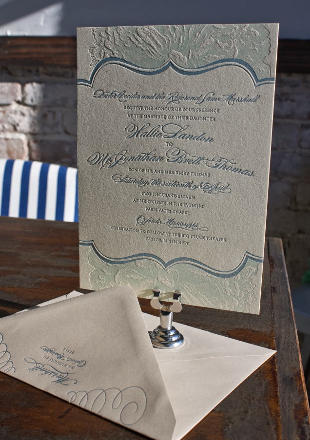
I’ve had the pleasure of working with 2 brides over the last couple of months with amazing visions for their Bespoke wedding invitations. Hallie and I met as art majors at Ole Miss, and I was flattered that she (a talented designer herself) called on Lucky Luxe to create her wedding invitations. She’s getting married in the same chapel at Ole Miss where Ben and I were married, then having a throw down wedding reception at the Big Truck Theater near Oxford. She wanted the invitations to reflect a mix of soft, traditional elements in desaturated grey, green and blue tones, and a rustic touch with kraft paper envelopes. The results turned out beautifully—possibly my favorite thing we’ve ever done:
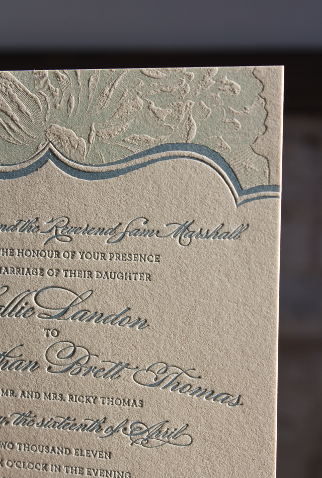
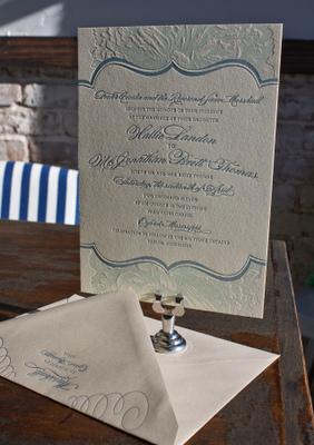 We used a celadon ink for the flowers, and vintage blue for the text.
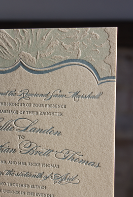
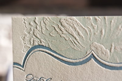 The flowers are so dimensional it’s like they’re real.
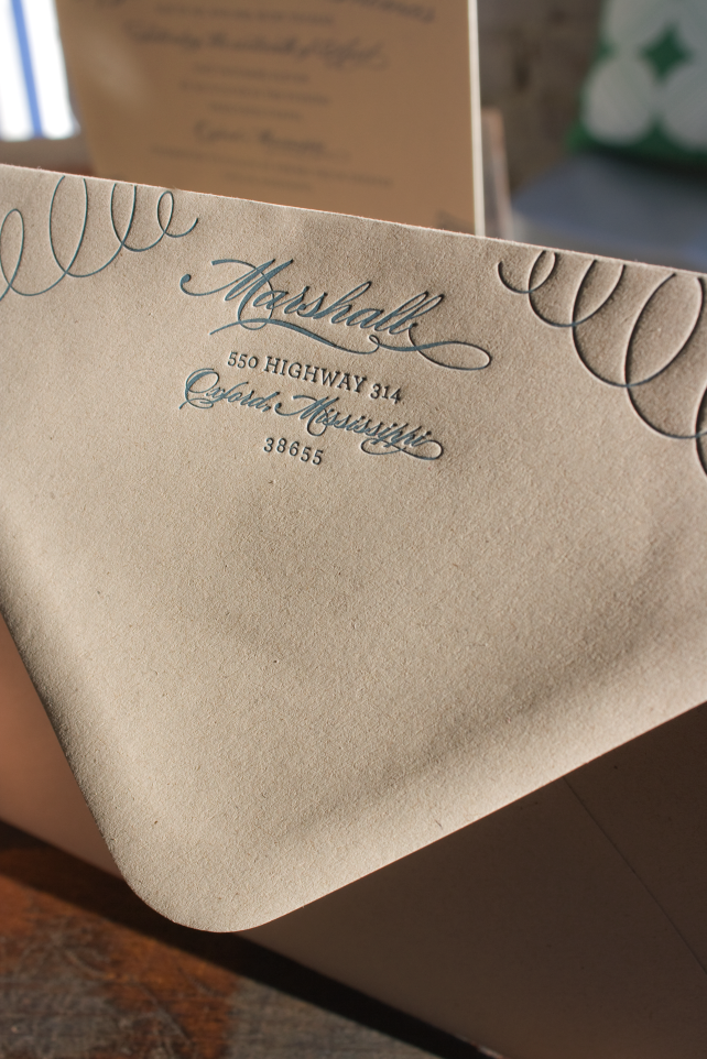
Kraft paper paired with traditional fonts
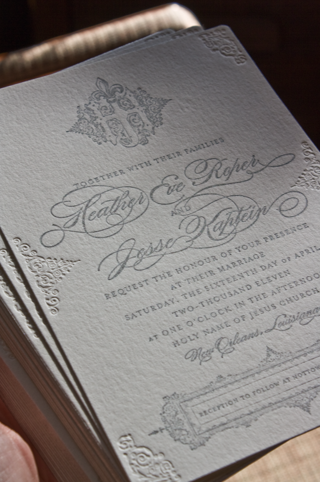
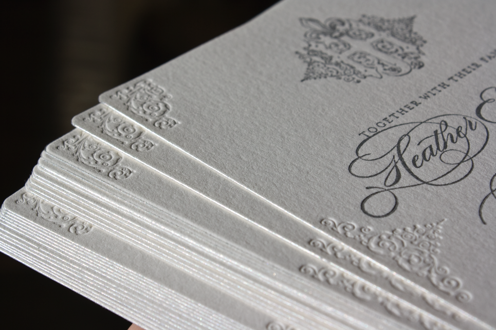
Heather & Jesse, a couple from London, wanted a glamorous invitation—silver script and formal serifs, with a monogram crest and painted edges. Her wedding will be a New Orleans soiree, and we wanted to bring the architectural and ornamental styles of the French Quarter into the design.
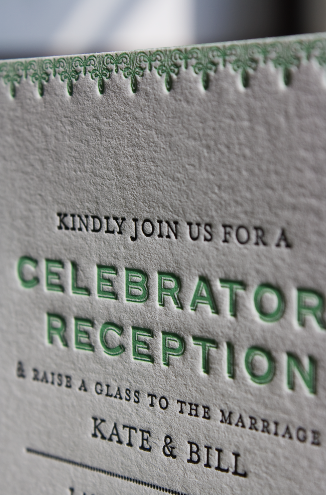
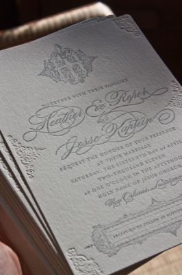 The blind embossed ornaments are the star of the invitation.
Don’t you love it when the paper takes an impression so beautifully, it’s like butter?