Eudora’s Debut in Southern Weddings

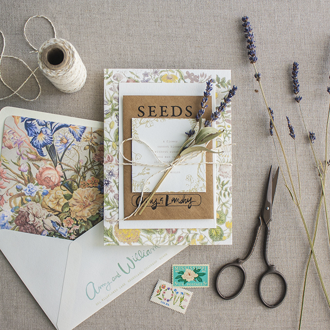
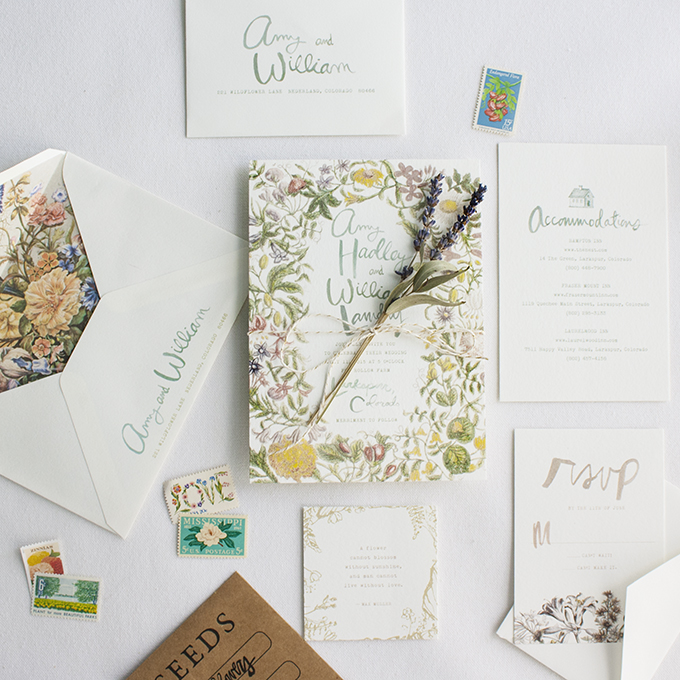
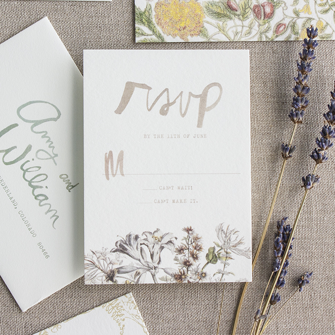
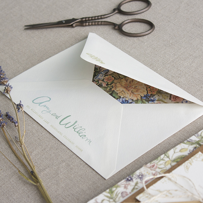
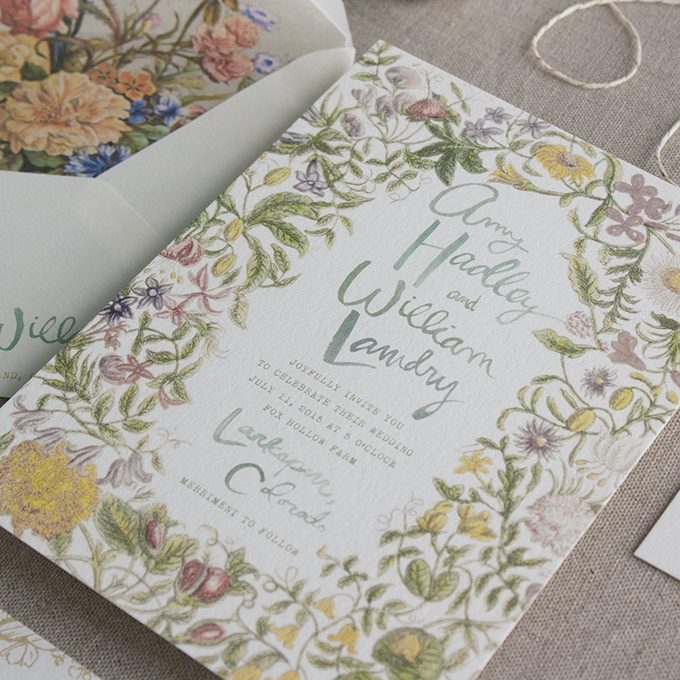
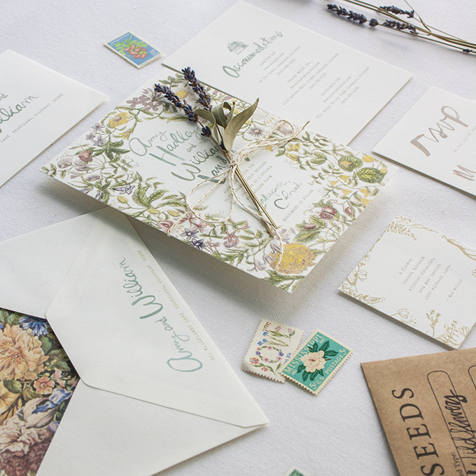
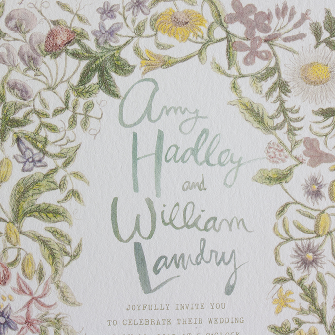
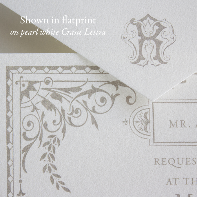
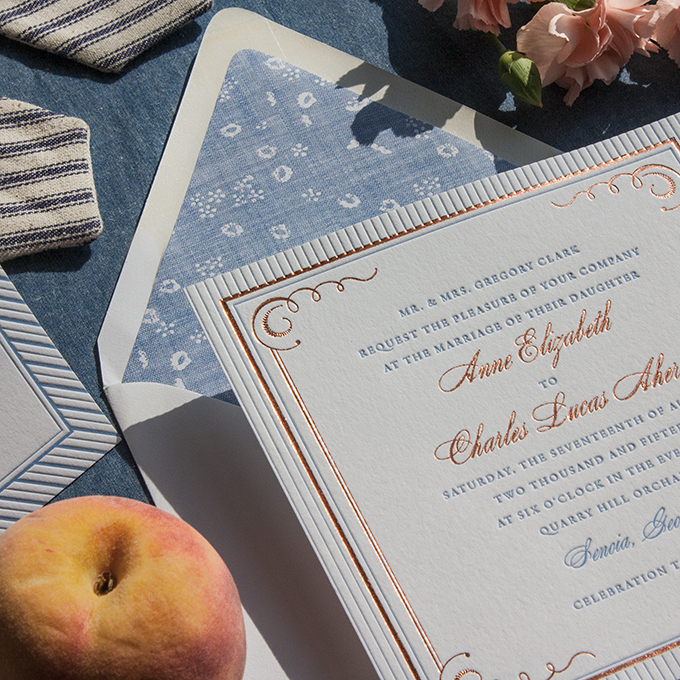
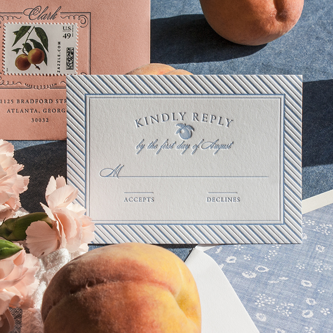
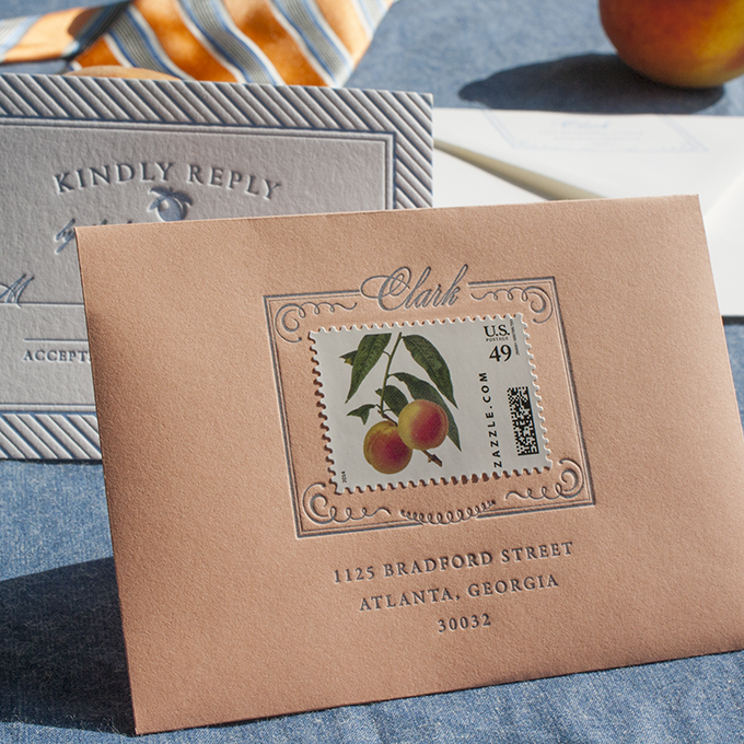
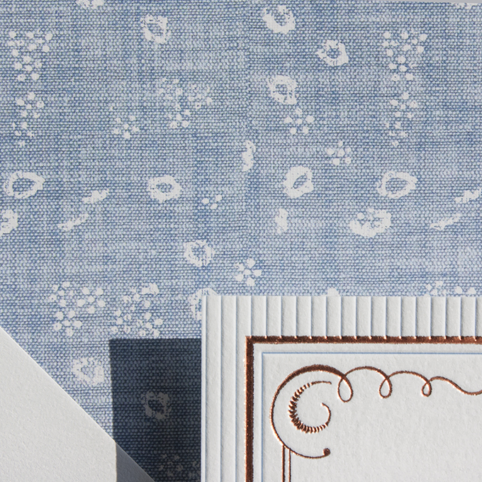
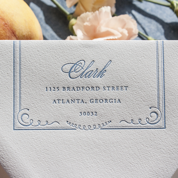
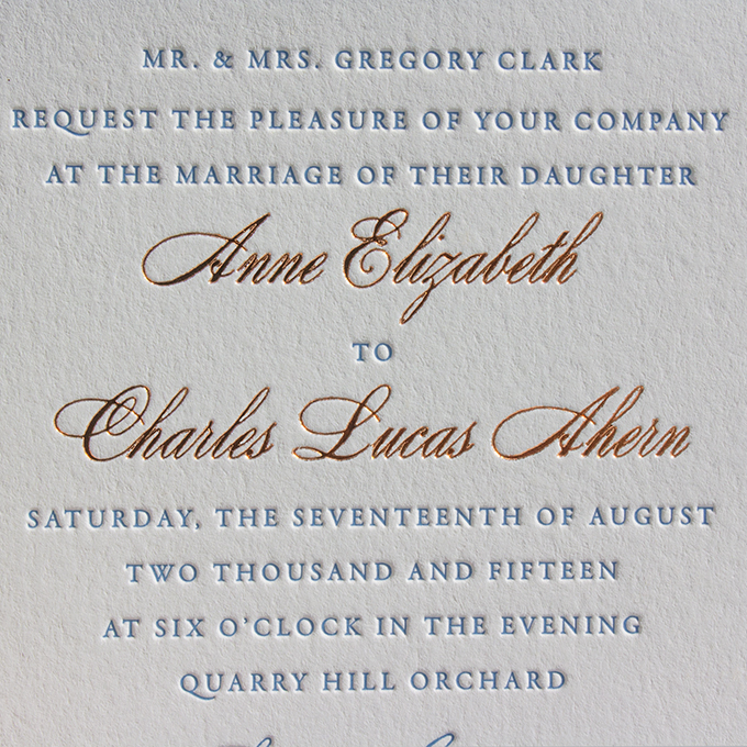
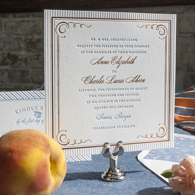
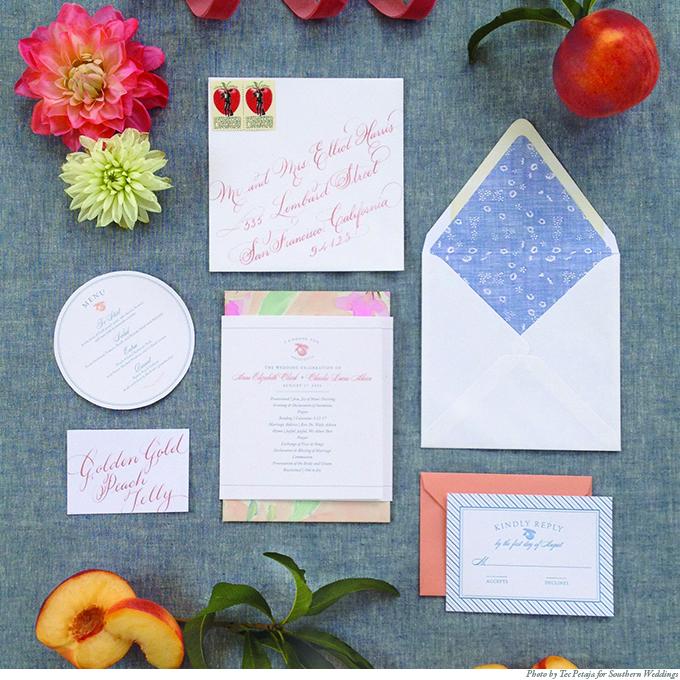
Early this year we were contacted by the sweet gals at Southern Weddings Magazine, the sister publication of Southern Living, who were interested in commissioning an invitation design that would compliment a peach orchard wedding. We were given lots of images of things like chambray bow ties, ethereal and simple wedding gowns, farm tables in the grass beneath chandeliered trees overlooking orchards, dusty peach velvet ribbons and tons of ripe, juicy peaches that made my mouth water. I set to work creating an invitation that would do such a setting justice and arrived at Eudora—our most genteel invitation to date, named for Ms. Eudora Welty.

banner

best IMG_9916 IMG_9929 IMG_9931 IMG_9934 IMG_9938 IMG_9935

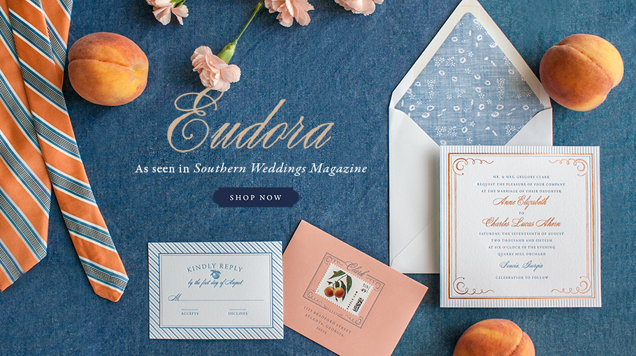
This week we’ve been waiting with bated breath for the arrival of Southern Weddings’ annual issue in stores and it’s finally here!

SWV7_1_grande

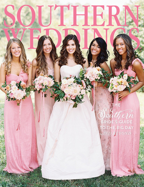
Our feature is on page 101 of the issue, photographed by the world renowned Tec Petaja:

SouthernWeddings copy

We’ve been so blessed by the press this year with features in some of the world’s best publications. Our cup overflows this Thanksgiving.


Time Machine

A few weeks ago was our city’s annual fall festival—the Loblolly Festival (it’s a pine tree species—our town was put on the map because of the great lumber barons that settled it). I’ve recently become friends with Michael N. Foster, a very talented tintype photographer from up north in Oxford, and somehow convinced him to come to the festival to shoot portraits for the day. And I’m so glad he did! Sitting for new Lucky Luxe headshots and seeing the process from start to finish, the wet plate developing, the chemical washes, the timing, it was kind of a miracle. If you ever have the opportunity to have a tintype photo taken, please do! It was like stepping into a time machine and coming out on the other side much prettier and cooler than you actually are in real life. Which is always good for the morale, isn’t it?

Screen Shot 2014-10-27 at 2.37.48 PM

Click here to see more of Michael’s beautiful work.


Introducing Flora

The Lucky Luxe Collection has been historically style-centric from the very beginning, and I realized we might be leaving out our more bohemian brides searching for an aesthetic that’s colorful and organic and those brides on a budget looking for interesting flat print options that don’t sacrifice high style. Letterpress might be the glamorous madame of printing methods, but it’s not for every budget, and it’s not always a great option for the client who wants a layering of color and gradients. The weddings we’re seeing of late are not stuffy. The bridesmaids are wearing what feels good on them, choosing a dress from their grandmothers’ cedar chests or Anthropologie. We’re seeing more intimate ceremonies in gardens and courtyard that focus less on a big party and more on what matters—the new family that’s beginning. So I’ve been thinking of ways our wedding paper design can more accurately reflect the feel of these simple, nature-inspired events.

We are excited to introduce Flora, a new design, created to be a reflection of that couple tied to the land and their love—not tied to the standards of wedding paper formality. The couple packaged the suite with simple seed storage packets from Williams-Sonoma and labeled and filled them with seeds from the iconic wildflower fields in Rabbit Valley, Colorado. They tied dried lavender in with gold and cream baker’s twine to complete the bundle. They make a sweet gift for the couple’s friends and family, and season after season, they are the perfect reminder: “A flower cannot blossom without sunshine, and man cannot live without love.” 

suite_linen suite_white RSVP RSVP_detail quotecard quote2 envelope envelopeinside invite angled_suite invite_detail flora

The script for the suite is painted by hand in watercolor, and all the fine text is an understated typeface taken from our old Remington typewriter. The invitations are then flat printed on 100% cotton Crane Lettra paper. The lettering choices, layered with colorful antique engravings from Furber’s Twelve Months of Flowers, published in 1730, create a composite that’s altogether modern, bohemian, and nostalgic. We’re thinking of Flora as the new flower child among her sisters in the Lucky Luxe wedding collection.

We’re also really excited to see her popping up over on Oh So Beautiful Paper in a feature today!


Lucky Luxe now available at Paper and Pearl

We’re really proud to announce that we’ve formed a wholesale partnership with a brand new online stationery boutique, Paper and Pearl, based in Rhode Island. You can find the Lucky Luxe wedding paper collection alongside the beautiful work of other stationers like Ink and Ivory,  Haute Papier, Sugar B Designs, and Rag & Bone Bindery. Hooray for expanding and making new friends in the world of pretty paper!

Screen Shot 2014-09-04 at 12.53.38 PM


Luxurious Crane Lettra—Now Available for Flatprint!

We’ve got very exciting news for our brides on a budget. We’re finally offering our same house letterpress paper and envelopes to bring you a new, luxurious flatprinted line of invitations. No more eggshell—this go round we’re now using only the heavyweight, creamy textured pearl white 100% cotton Crane Lettra that makes our letterpress invitations so supple and substantial.

LadyMary_2014 LadyMarydetail_2014 Mariner_detail Mariner bernhardt_detail bernhardt

We’ll be adding to the flatprint sample Collection over the next few weeks for those of you interested in feeling some pretty, flatprinted papers in your hands. 


Bernhardt for Martha Stewart Weddings

The wait is finally over! We’re so excited to finally introduce the newest members of the Lucky Luxe design collection— the Bernhardt invitation and the Peacock save-the-date, both featured in the fall 2014 issue of Martha Stewart Weddings.

Screen Shot 2014-08-28 at 11.19.12 AM

paperbacksMSW_bernhardt

In October 2013, the magazine contacted us to commission an art nouveau inspired invitation for a story on invitation designs by decade. The seeds for this design were planted with Muse, our art nouveau invitation predecessor. I so enjoyed exploring the ethereal aesthetic of that period and stepping back from the geometric glamour of the 1920s that brides have been loving for the last couple of years. I’m not a very sharp-edged kind of designer typically and so I tend to agree with Marion Cotillard’s enchanting character from Midnight in Paris, who longs to be part of the Belle Époque, a time period she never got to experience in person. Anyway, Bernhardt is here now, and I hope she inspires your wedding in the same way she inspired my psyche when we were creating the design.

Screen Shot 2014-08-28 at 11.18.10 AM

Screen Shot 2014-08-28 at 11.17.54 AM

Screen Shot 2014-08-28 at 11.21.22 AM


Branding Lucky Luxe

Guys, it’s been eating at my soul lately how indifferent and even… Displeased I am with the Lucky Luxe logo. The current incarnation is just a slightly modified version of the original design I came up with on a 30 minute whim in 2008 when I started a free blog for my freelance work that I decided, on a whim, to call Lucky Luxe.

If I could go back in time, I’d call it Magnolia Street Press or Magnolia Street Paper Co., but alas—it is what it is and now I’m married to it. Ben says he’s the lucky and I’m the luxe, so I’ll let that give me solace in its sweetness.

But I don’t have to be married to the logo anymore. Nope.

I’ve spent many many hours in the last few days, and particularly today, wracking my brain, digging deep into my bag of tricks in search of the perfect flourishes and fonts that capture what the brand is about in a single iconic image—which I think would be modern nostalgia. If such a thing can exist. And Southern. And friendly. And American. And European. Ugh.

I’ve been scanning and reworking vintage map titles from the 1800s, Civil War era sheet music, CV cards, poring over Louise Fili’s entire body of work, searching all things ephemeral and antique… Then pairing with every modern, simple typeface under the sun. I design everything in black, and once I like a logo—only then do I consider color. My design professors in art school told us that a great logo can be drawn with only a black Sharpie. Want to see a tiny, cropped, zoomed in snapshot of what the inside of my head looks like when I get like this?

Frustrating. But it’s so… SO… fun.

Though I think the winner winner chicken dinner is there. Can you guess which one? Do you have a favorite? Is there even a way to tell me which one it is if you do? Ginny, if you’re reading this, here’s proof that I sketch in my own way. Mama and daddy, that money you spent on college was apparently worth it.


Welcome Big Ben… Full time!

You can find the entire harrowing story on my personal blog of how Ben has made the decision to follow God’s calling into working with me full time at Lucky Luxe. It’s a huge, exciting leap of faith for us and I’m so excited that starting November 1, I’ll be working side by side with my biggest crush ever. Every day. He’s dreamy.

IMG_7942B

Photo by Brooke Davis