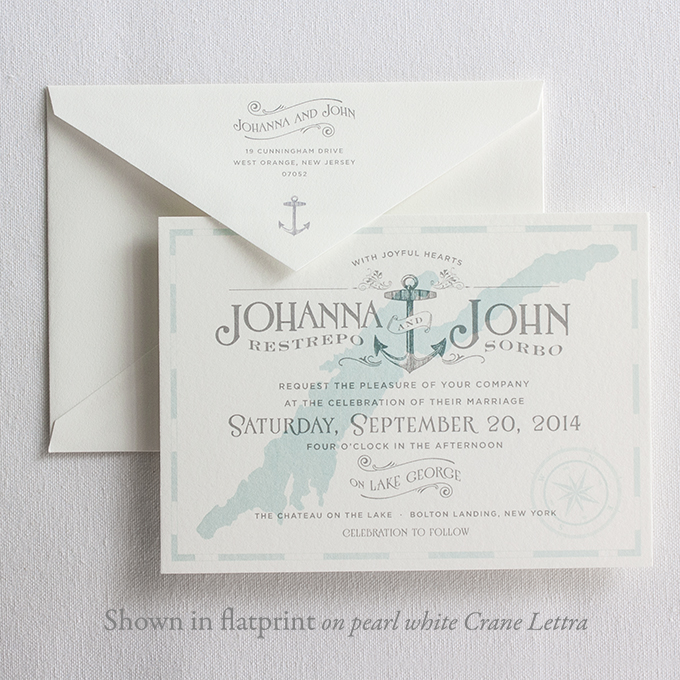
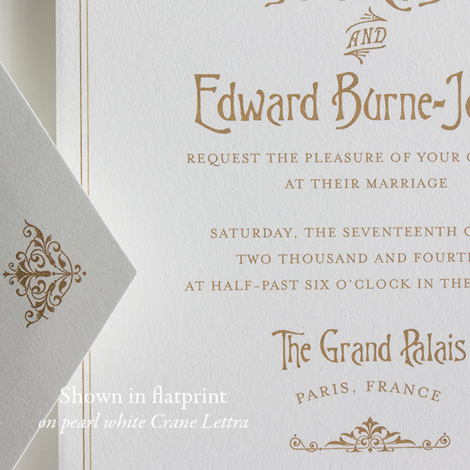
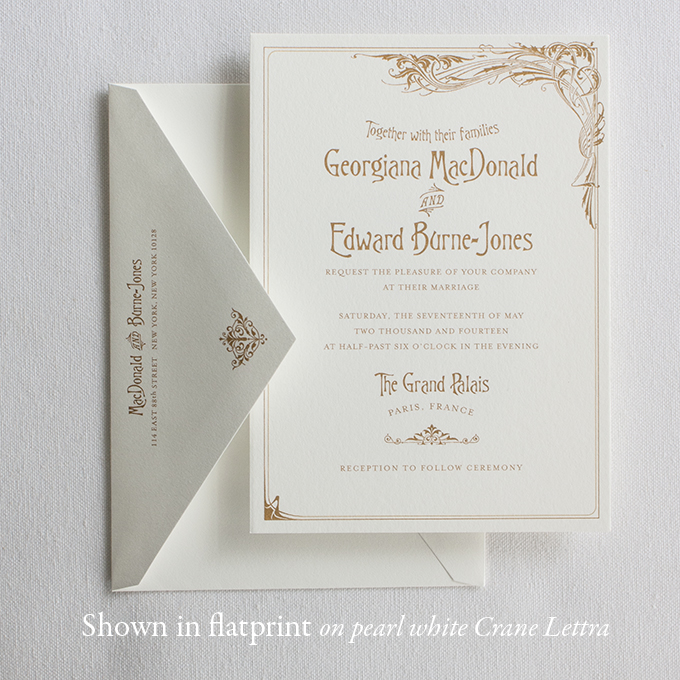
Luxurious Crane Lettra—Now Available for Flatprint!

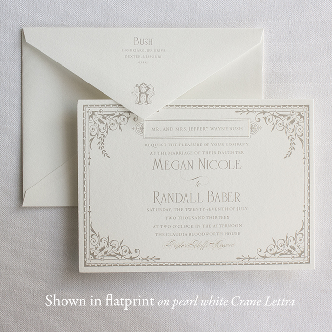
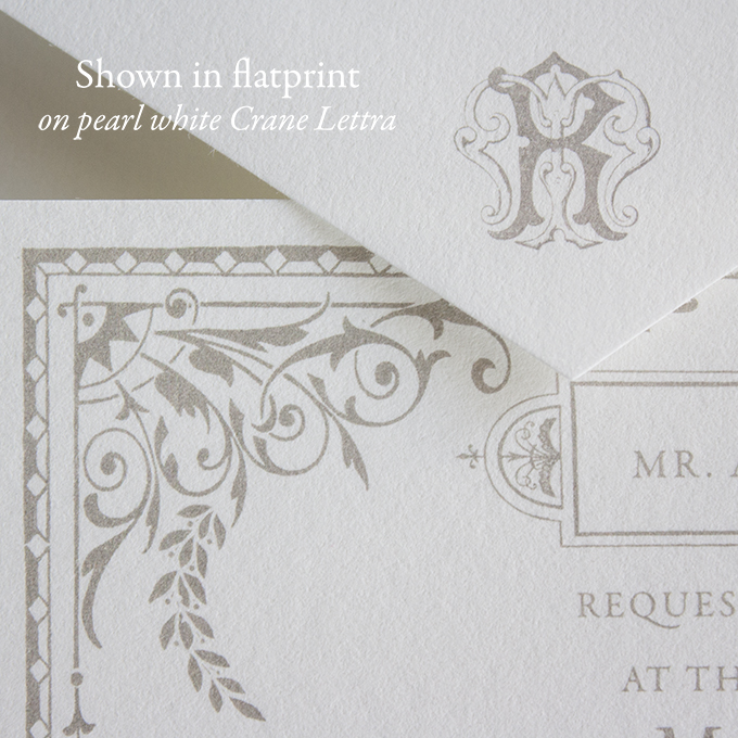
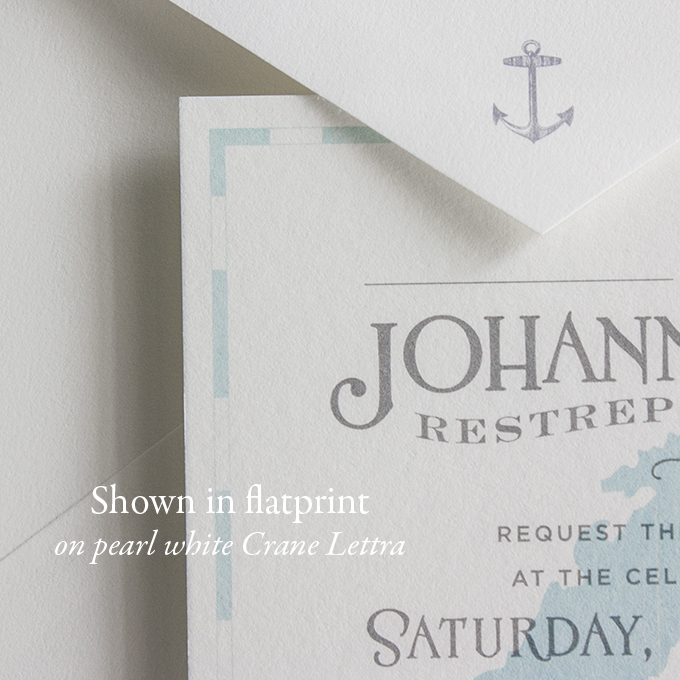
We’ve got very exciting news for our brides on a budget. We’re finally offering our same house letterpress paper and envelopes to bring you a new, luxurious flatprinted line of invitations. No more eggshell—this go round we’re now using only the heavyweight, creamy textured pearl white 100% cotton Crane Lettra that makes our letterpress invitations so supple and substantial.

LadyMary_2014 LadyMarydetail_2014 Mariner_detail Mariner bernhardt_detail bernhardt

We’ll be adding to the flatprint sample Collection over the next few weeks for those of you interested in feeling some pretty, flatprinted papers in your hands. 

Branding Lucky Luxe

Guys, it’s been eating at my soul lately how indifferent and even… Displeased I am with the Lucky Luxe logo. The current incarnation is just a slightly modified version of the original design I came up with on a 30 minute whim in 2008 when I started a free blog for my freelance work that I decided, on a whim, to call Lucky Luxe.

If I could go back in time, I’d call it Magnolia Street Press or Magnolia Street Paper Co., but alas—it is what it is and now I’m married to it. Ben says he’s the lucky and I’m the luxe, so I’ll let that give me solace in its sweetness.

But I don’t have to be married to the logo anymore. Nope.

I’ve spent many many hours in the last few days, and particularly today, wracking my brain, digging deep into my bag of tricks in search of the perfect flourishes and fonts that capture what the brand is about in a single iconic image—which I think would be modern nostalgia. If such a thing can exist. And Southern. And friendly. And American. And European. Ugh.

I’ve been scanning and reworking vintage map titles from the 1800s, Civil War era sheet music, CV cards, poring over Louise Fili’s entire body of work, searching all things ephemeral and antique… Then pairing with every modern, simple typeface under the sun. I design everything in black, and once I like a logo—only then do I consider color. My design professors in art school told us that a great logo can be drawn with only a black Sharpie. Want to see a tiny, cropped, zoomed in snapshot of what the inside of my head looks like when I get like this?

Frustrating. But it’s so… SO… fun.

Though I think the winner winner chicken dinner is there. Can you guess which one? Do you have a favorite? Is there even a way to tell me which one it is if you do? Ginny, if you’re reading this, here’s proof that I sketch in my own way. Mama and daddy, that money you spent on college was apparently worth it.

Welcome Big Ben… Full time!

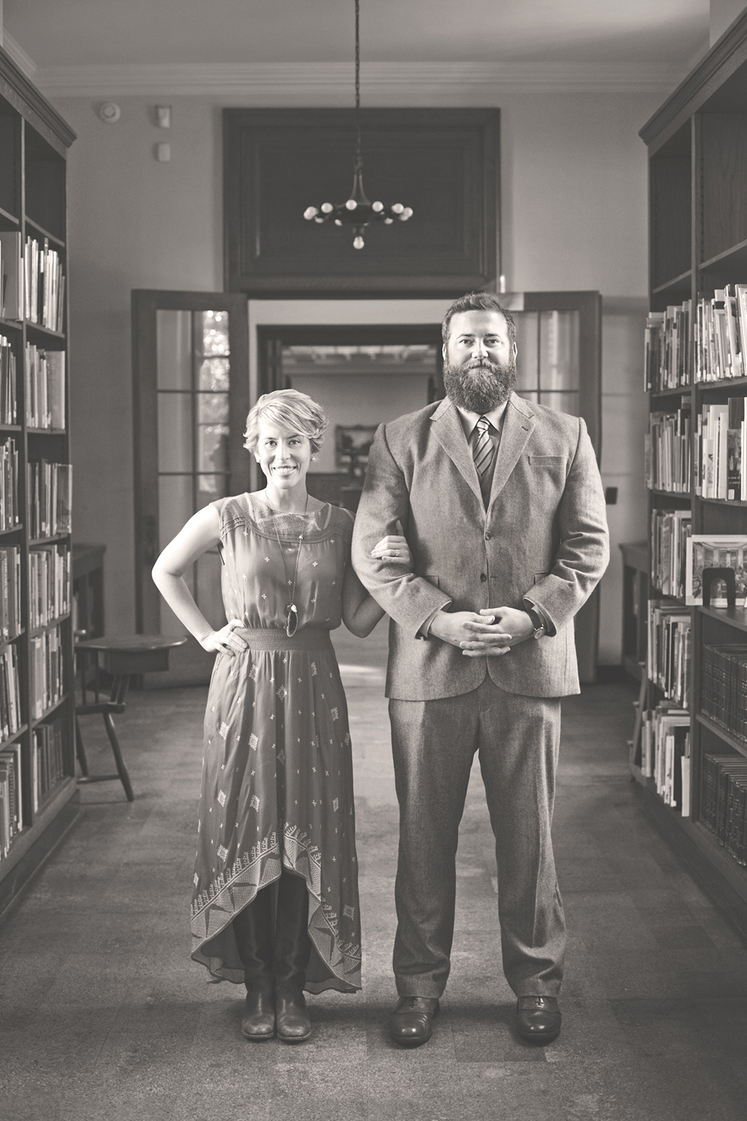
You can find the entire harrowing story on my personal blog of how Ben has made the decision to follow God’s calling into working with me full time at Lucky Luxe. It’s a huge, exciting leap of faith for us and I’m so excited that starting November 1, I’ll be working side by side with my biggest crush ever. Every day. He’s dreamy.

IMG_7942B

Photo by Brooke Davis

Playing with ink…

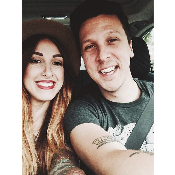
So BJ was a buddy of Ben’s in high school, they’ve stayed in touch all this time, and nowadays you can find his band, American Aquarium on tour around the world. They’re one of the best alt-country bands in the country (and my favorite, at any rate). He stays on the road playing shows most of the year so odds are that they’ll be coming to your town sooner or later and you NEED TO GO SEE THEM PLAY. When BJ proposed to his absolutely adorable girlfriend, Rachael, a few months ago—I got a text with some inspiration images for their own custom invitations.

Screen shot 2014-08-08 at 10.46.49 PM

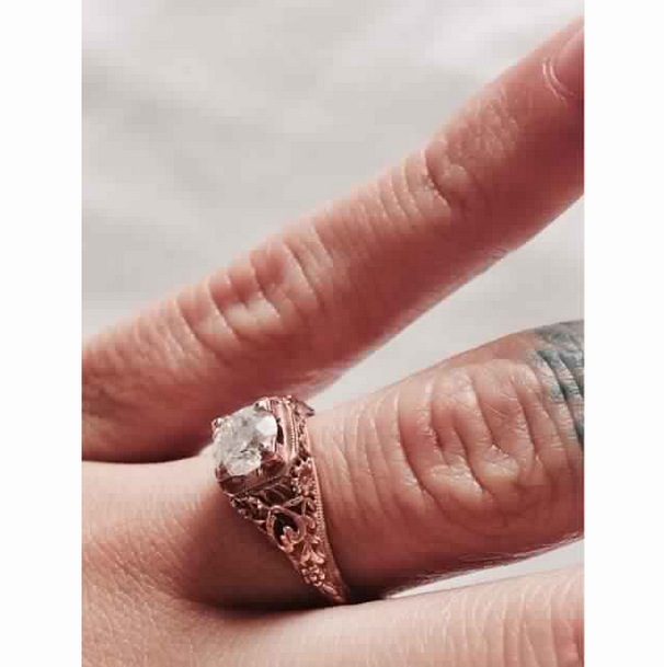
Let’s all take a collective sigh over her antique rose gold enagement ring. Good job, Beej.

Screen shot 2014-08-08 at 10.47.02 PM

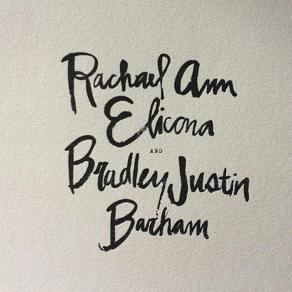
And today I got to work creating some initial concepts. I played around with brushes and ink on some hand lettering of their names, threw it at them… and it stuck. Here’s a little sneak peek for now:

Screen shot 2014-08-08 at 10.07.33 PMThat’s gonna look like butter in letterpress. Mmmmm…

Throwback Thursday: Martha Stewart Weddings Tour

I recently realized I never blogged about when we got to visit Martha Stewart headquarters in NYC last fall (2013) and with our upcoming feature in the magazine finally releasing on September 1, I think a Throwback Thursday is in order. This whole post is taken from my personal blog, Make Something Good Today, that I write every single day no matter what happens, and no matter how tired I am at the end of the day, that documents the best thing that happened that day. At the time we were on a trip to New York with a couple of our Nashville friends, Kory and Beth.

So we started the day with a long train ride to the Upper West Side for breakfast near Central Park at Sarabeth’s. Ben and I went here for the famous English muffins on our honeymoon in 2008.

Then walked through Central Park seeing all the big sights that are famous from movies.

Then lunch a while later in the Burger Joint at Le Parker Meridien, a tiny, seedy hole in the wall behind the velvet curtain in the lobby of a swanky hotel. It’s so peculiar, and that’s what makes it one of our favorite places in New York. You know you’ve found the spot when you see the neon burger.

Then Ben and I left for Chelsea where I had a meeting with an editor, Cassidy, at Martha Stewart Weddings. And a completely crazy thing happened.

I saw Martha. THE Martha, reviewing some products for her Macy’s line. Just 10 feet away from me. I couldn’t take her picture without getting in trouble, so I just pretended it was a typical occurrence to breathe the same air as Martha Stewart and nodded my head and seemed vaguely excited. I was screaming inside. Cassidy walked me around, showing us the “kitchen” they use to film her cooking show (surprise—the farm scene out the window is a high def photo!)

She showed us the prop room for photo shoots for Weddings and Living. Fascinating! My favorites were the drawers and drawers of antique silver and the cake plate collection.

The Martha empire covers the complete 9th floor of the building in lofts that overlook the Hudson River. The views were unbelievable.

And later on we went back to the house in Brooklyn to get ready for dinner at Bamonte’s. Bamonte’s is on so many lists as one of the best old fashioned Italian restaurants in New York, though it’s in the Williamsburg neighborhood of Brooklyn. Lots of Sopranos episodes were filmed here, and an episode of Law and Order SVU aired last week that was shot here too. It was delicious. Tuxedoed waiters with thick Italian accents take your order while the beautiful 3rd generation owner, Anita, greets people as they eat. Well… She and Ben hit it off. Major. She kept calling him “big boy,” and telling us stories of the celebrities and mobsters who’ve darkened the door of Bamonte’s in its 100+ years. She counts Jack Nicholson a good friend, and Leonardo DiCaprio is coming by soon. They’ve been told to prepare a table for him. She hopes she’s there when he comes—though she fears her heart might stop beating at the sight of his handsome face.

There are still old wooden phone booths in the restaurant so you can take a business call while you’re at dinner if you need to.

It made my heart ache a little when I saw another of Anita’s friends on our way out. Jim Gandolfini, only my favorite person ever.

Speaking of, tomorrow’s blog will be about the Sopranos tour Ben and I are taking into Jersey. Aren’t you thrilled? Probably not. In fact, I’m embarrassed about my love for a show that went off the air about a million and a half hours ago. But it is my blog, and I have to be real with y’all. It’s definitely going to be the best thing about my day.

P.S. Dessert at Junior’s Bakery in Brooklyn. World famous cheesecakes!

Renate & Jad’s Coastal Italian Wedding

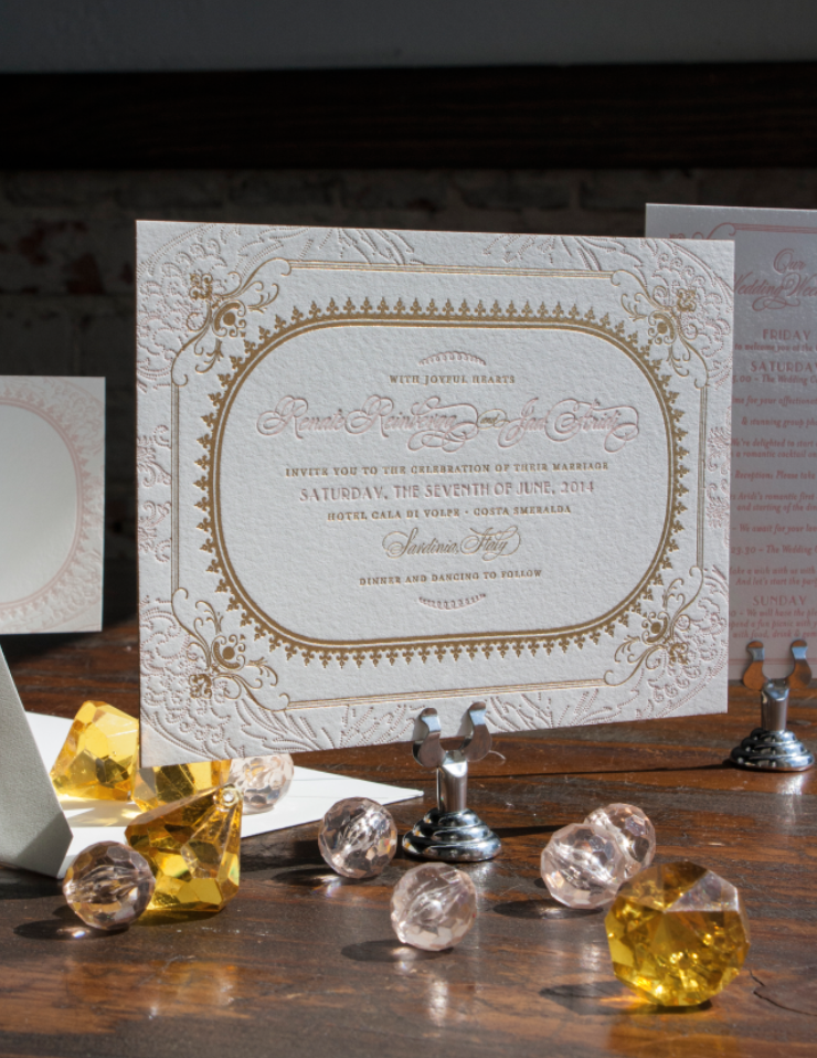
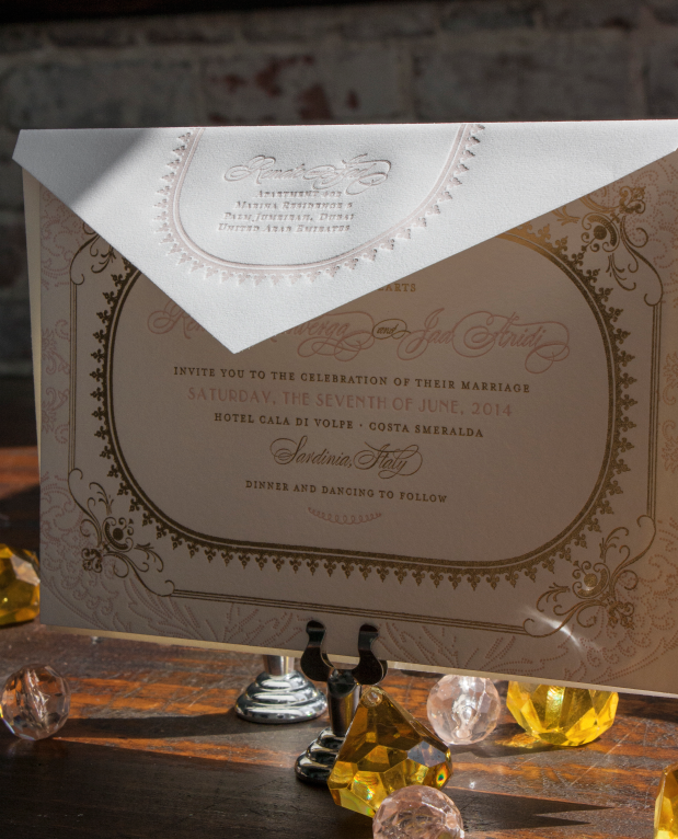
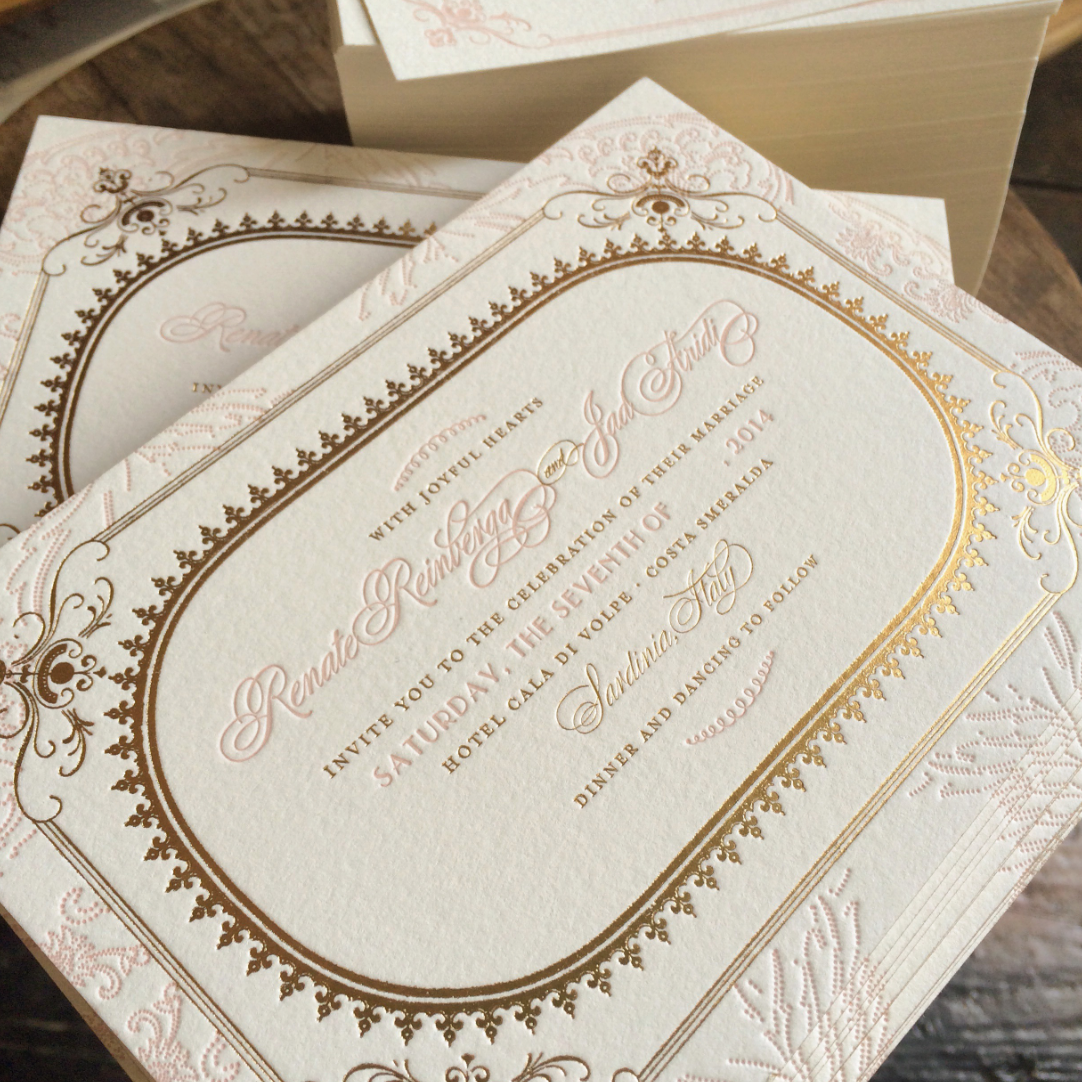
We shared a little sneak peak of Renate and Jad’s wedding invitation back in the spring and today I’m excited to tell you a little more about their elegant and romantic suite.

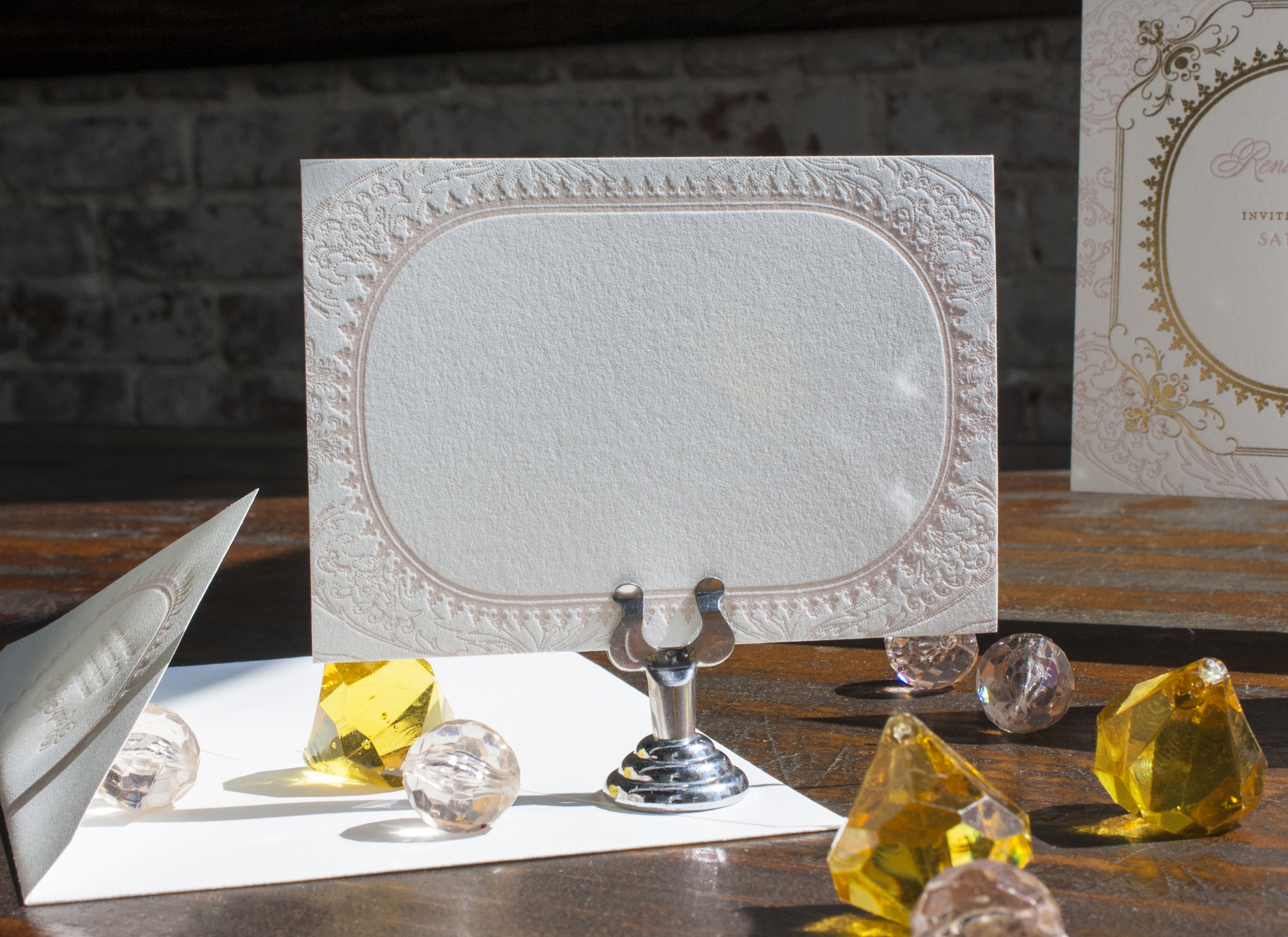
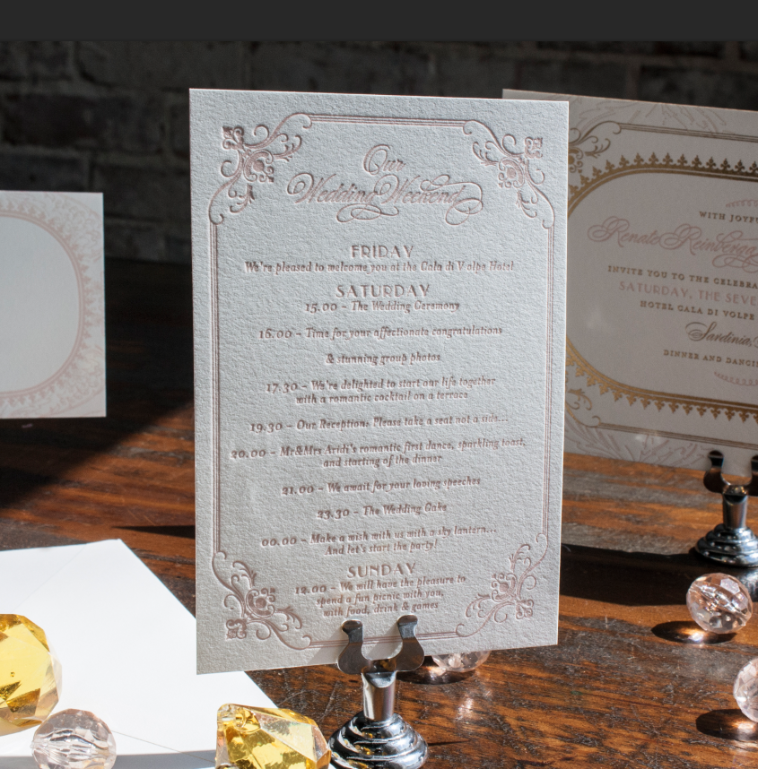
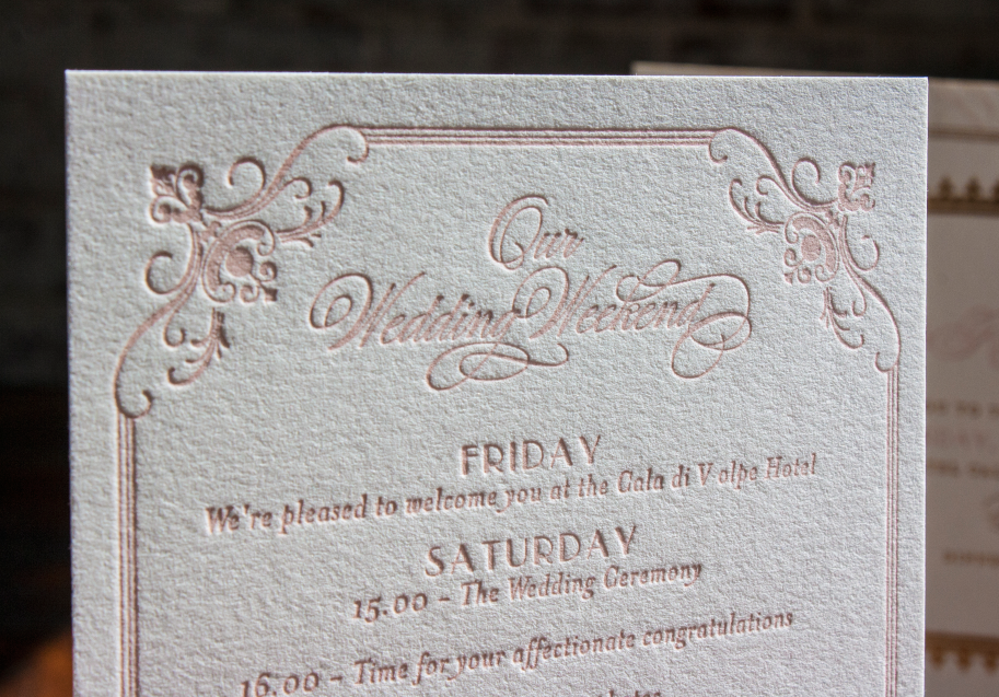
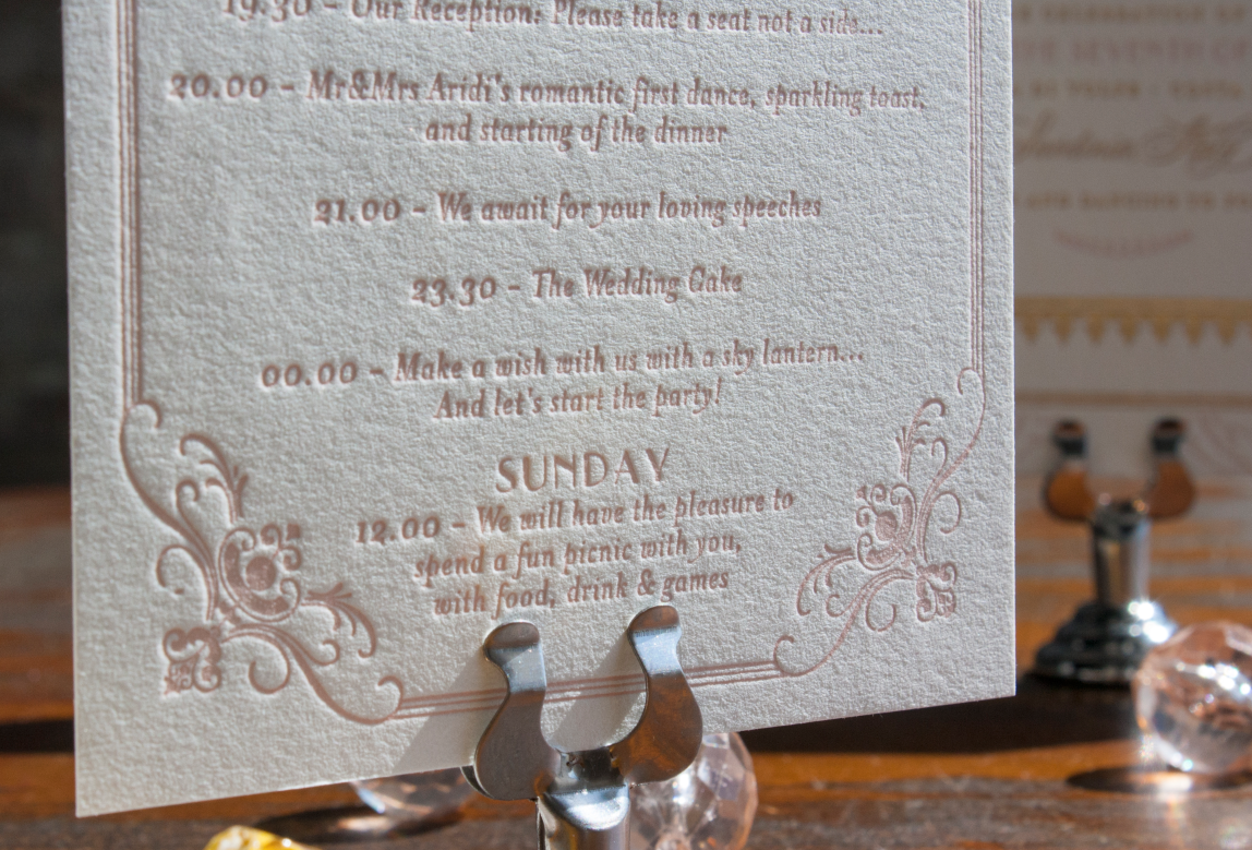
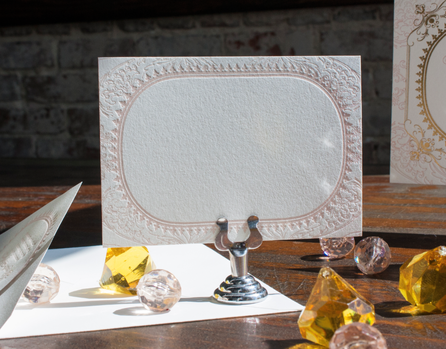
Their wedding took place in Sardinia, Italy in June—a part of the world I’ve been dreaming of visiting for SO long! We worked closely with her event planner out of Sassari, Italy, Elisa Mocci, who initially shared an inspiration board that helped me to imagine the delicate, filigreed design. Renate chose blush pink and gold foil letterpress on double thick pearl white paper with gold edge paint, an itinerary card, and place cards for the reception.

placecard Screen Shot 2014-07-09 at 3.20.00 PM Screen Shot 2014-07-09 at 3.20.06 PM Screen Shot 2014-07-09 at 3.20.15 PM Screen Shot 2014-07-09 at 3.20.22 PM Screen Shot 2014-07-09 at 3.20.27 PM Screen Shot 2014-07-09 at 3.20.31 PM Screen-Shot-2014-04-21-at-3.36.32-PMSo dreamy. Maybe I’ll finally plan that trip in 2015!


Piril & Igno’s London + Istanbul Wedding

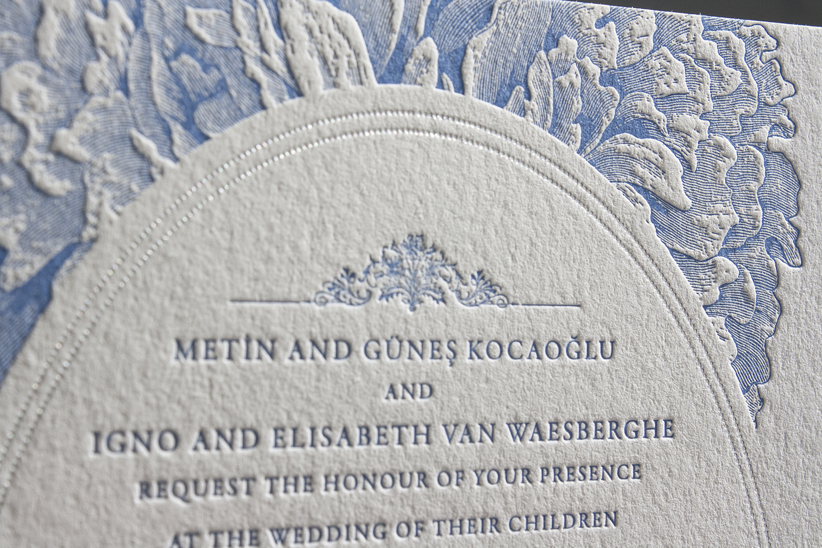
This is it, y’all. The most lavish and involved paper suite we’ve ever designed for a client! Typically I would say that designing their custom invitations was the most fun of the process, but in this case, Piril and Igno were my very favorite part of it all. We became friends along the way and I would look forward to hearing from them every day as we worked through the revisions and ideas. We Skyped daily during the process, she in London or Istanbul, watching as I sketched, offering ideas and input, introducing me to Igno and her mama through our computer monitors, it felt like we were old friends before long. I had to go into the hospital for surgery 2 weeks earlier in the year , and they sent me the loveliest bouquet of lilies and roses that made me thankful that so often my work is more than invitations—it’s friendship, too.

Now that their wedding and reception have come and gone in the last couple weeks, I can finally share all the beautiful details! Piril is Turkish, Igno is Dutch, and they live in London. Her pinterest board focused on Delft blue china in a nod to Igno’s Dutch heritage, with equal parts ornate Turkish elements and pretty florals.

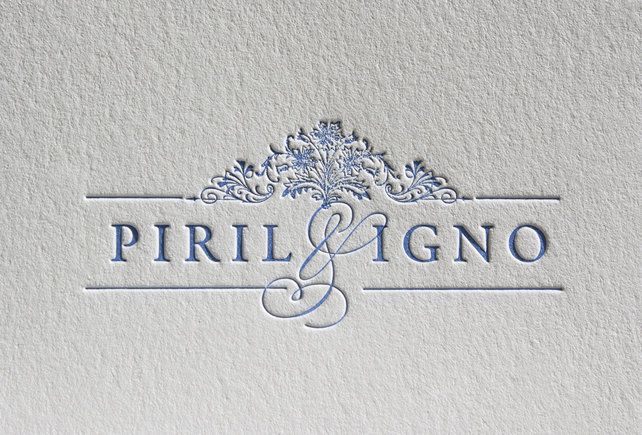
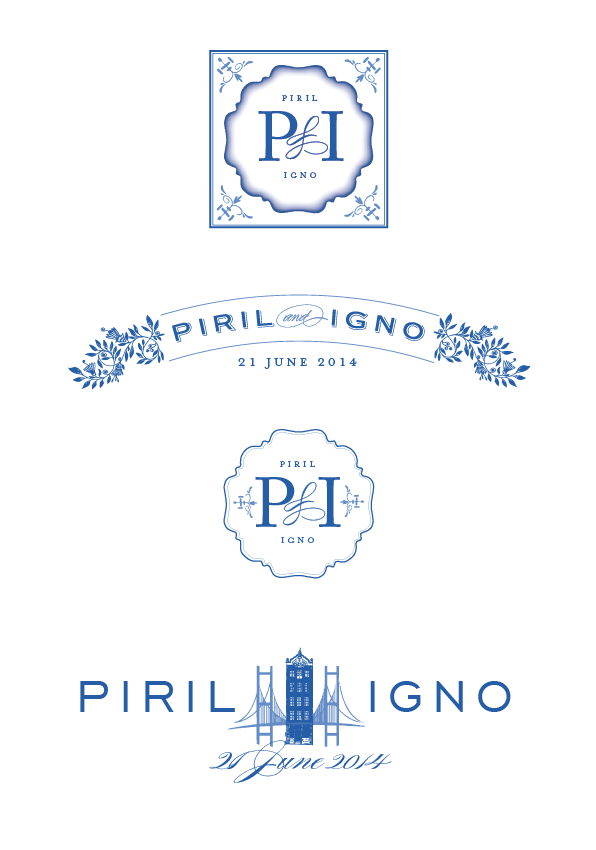
Our work began with a custom logo that they could use for each event. There were so many ideas and almost-the-ones!
Screen Shot 2014-07-02 at 12.40.47 PM

And then finally, THE ONE.

logo

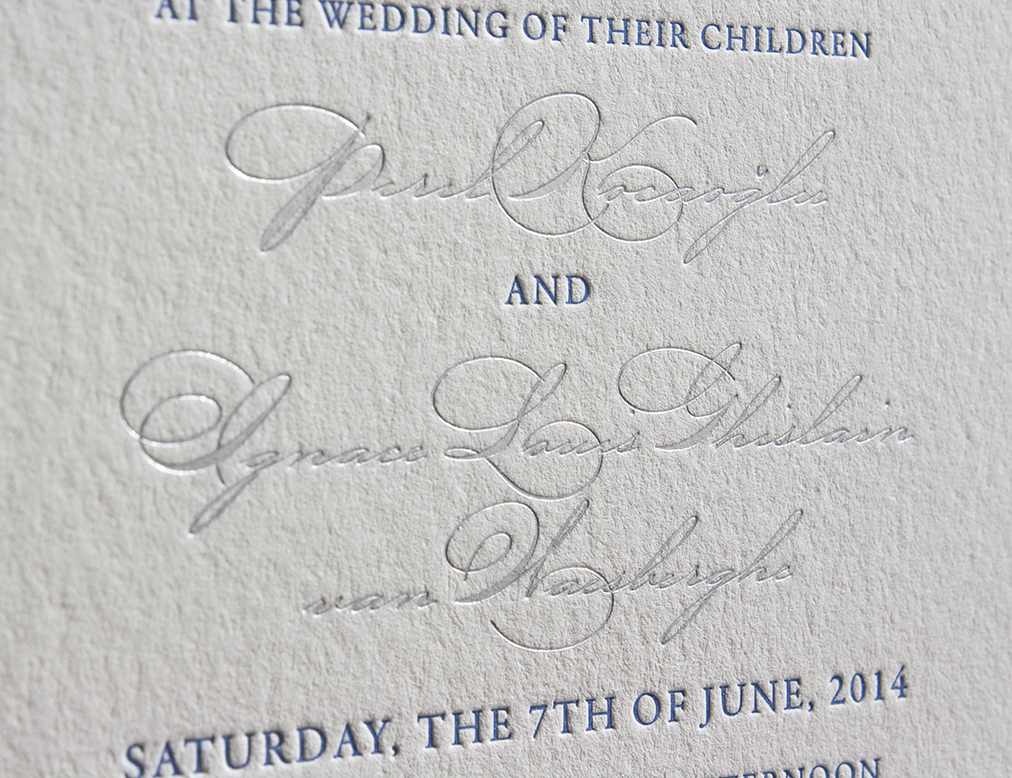
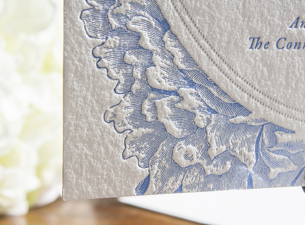
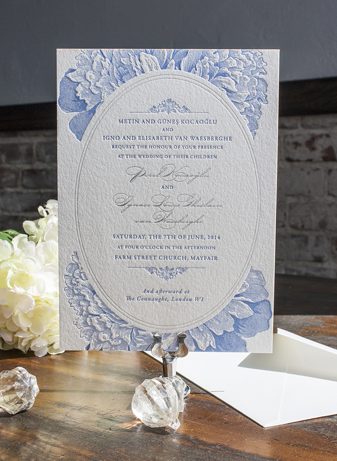
After working through lots of ideations of what the invitations would include, we arrived at an online save-the-date sent via email along with flatprinted save-the-dates to keep, a paper suite to include an invitation to their intimate June 7 church wedding ceremony and reception at The Connaught in London in English, printed in periwinkle and silver foil letterpress. We decided it best to keep this invitation simple with just an envelope, to let the extravagant Turkish event’s invitations shine with its size and all its elements.
london london2 london3 london4

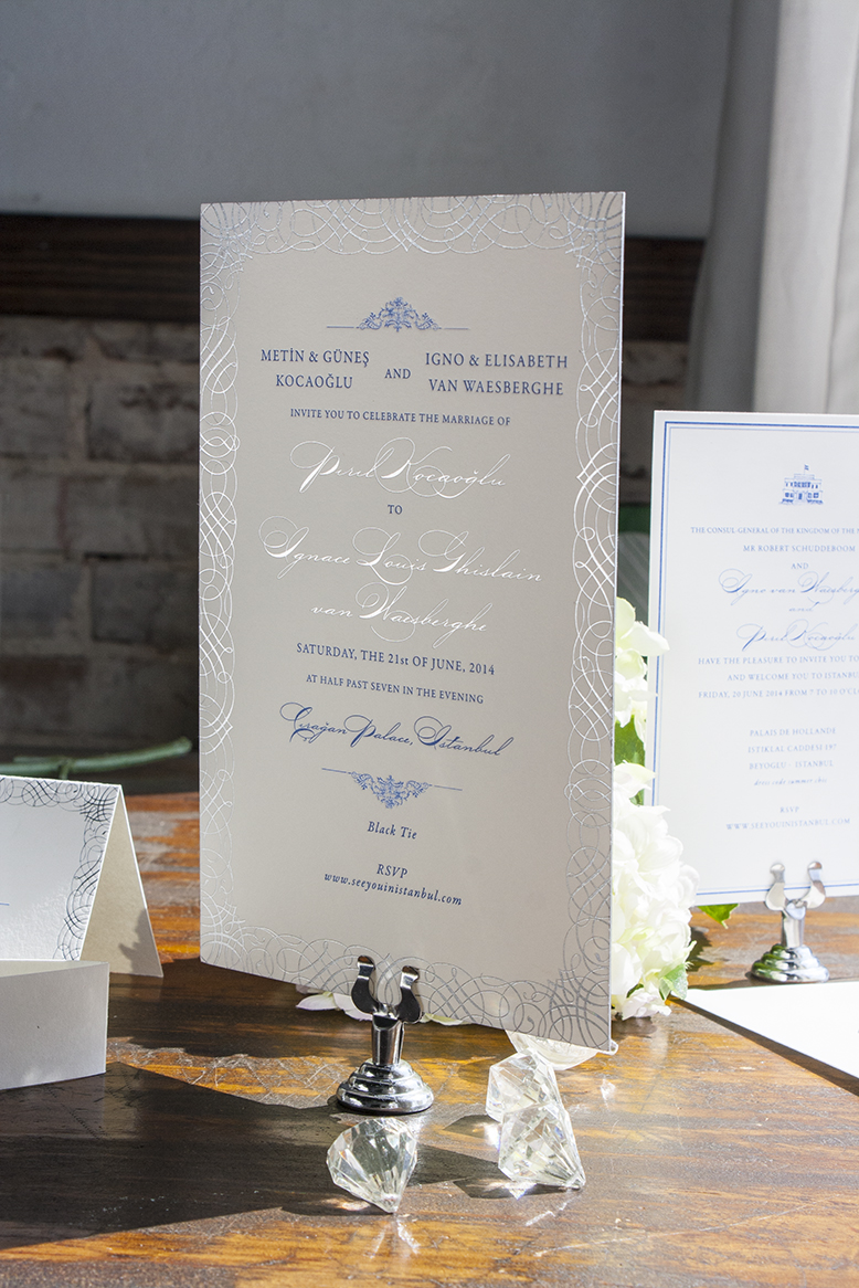
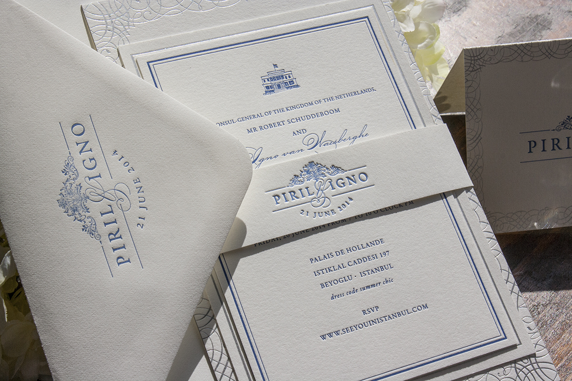
Then an elaborate invitation suite in both Turkish and English for their very grand reception in Istanbul at the former Ottoman palace, Ciragan Palace, 2 weeks after the wedding.

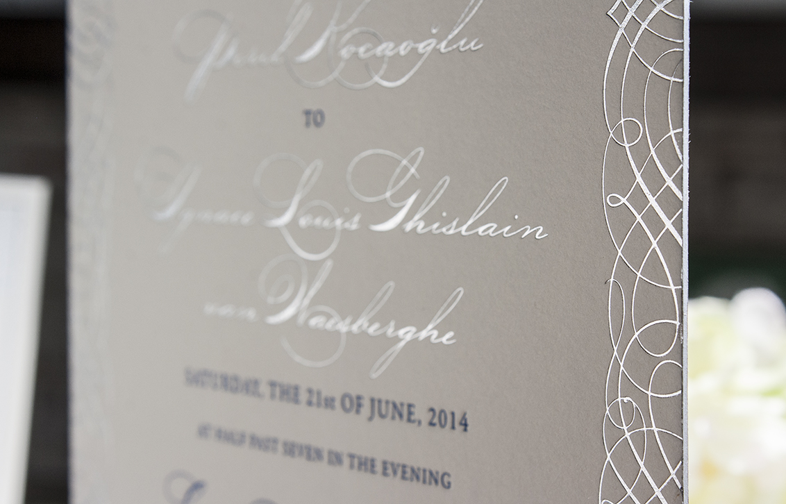
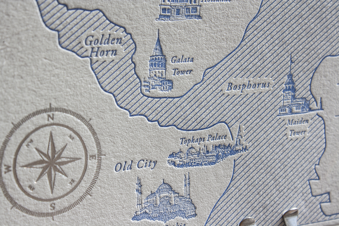
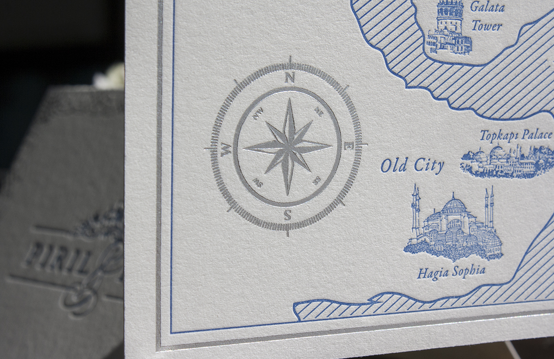
I’ve never worked on an invitation with such attention to the setting, the language details and Turkish elements, and it was fascinating. This suite was printed larger than our normal invitations at 5.5″ x 8.5″, on double thick Crane Lettra with silver edging in Delft blue, periwinkle, and silver foil letterpress, included silver envelope liners, belly bands, and tiny little custom hand drawn illustrations of Turkish landmarks that were part of their celebration weekend.
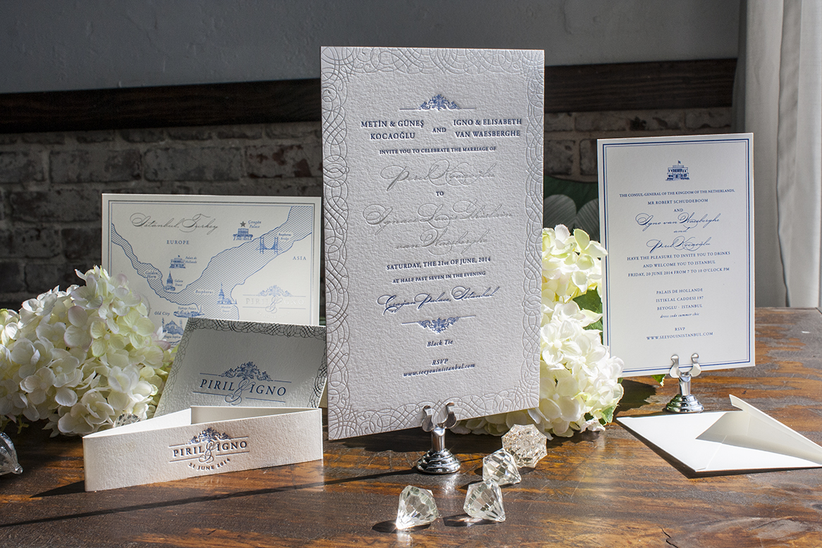
suite2 suite3

invitationfoildetail

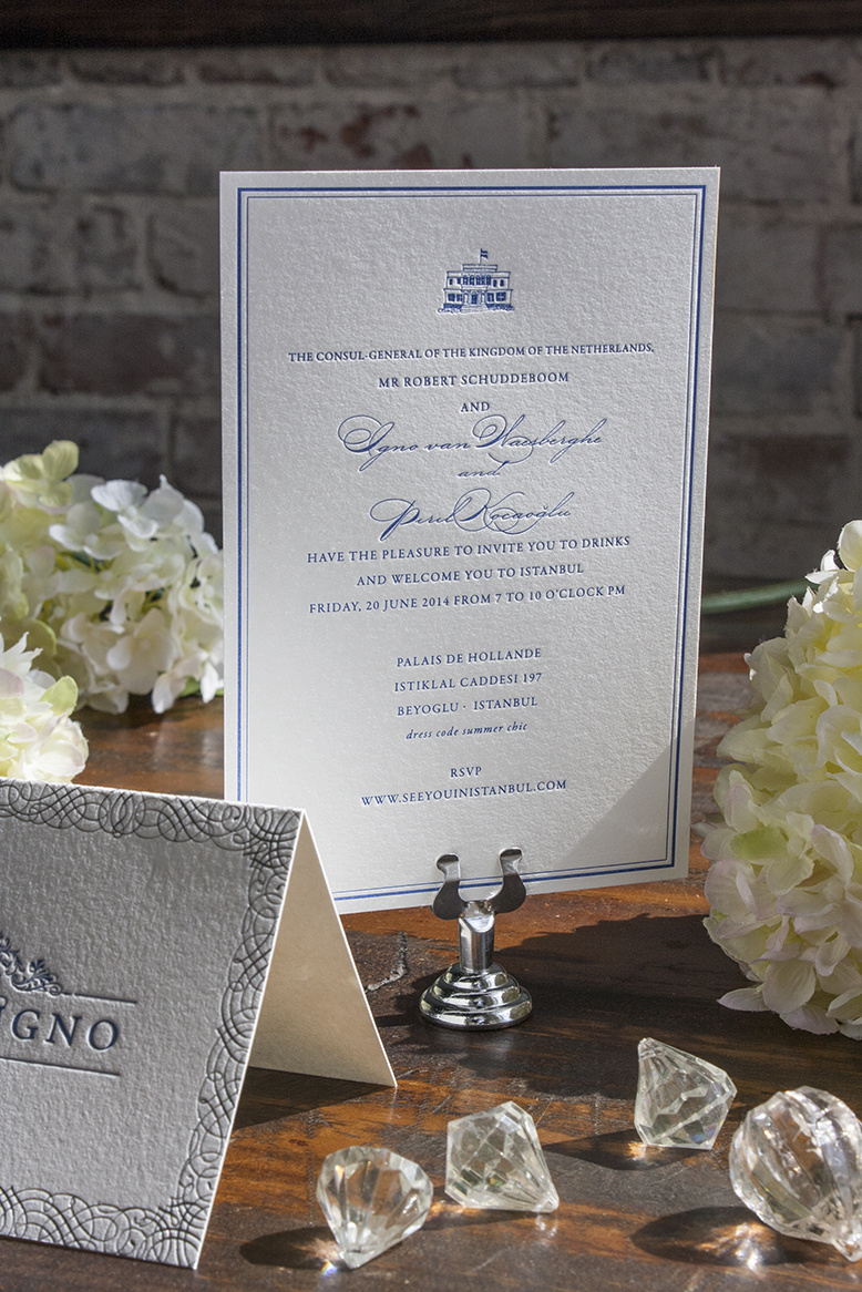
Their rehearsal dinner was hosted by the Consul-General of the Netherlands at the Dutch consulate in Istanbul. How cool is that? Drawing these tiny illustrations of the buildings made feel like a college girl again—using pens and ink just isn’t part of my daily routine like it was in art school.
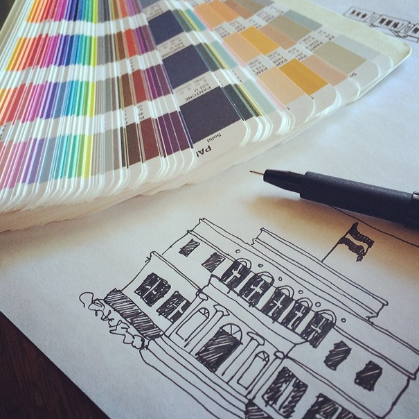
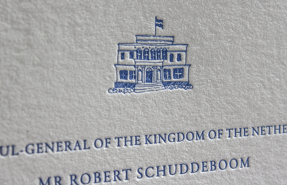
Screen Shot 2014-07-02 at 12.50.05 PM

holland rehearsal

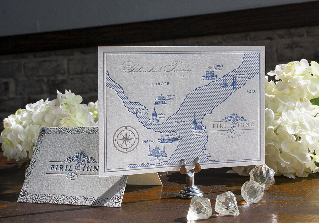
Since so many of their guests would be coming from Holland for the event, custom illustrated maps of Istanbul in Delft blue and silver foil were a fun necessity that also incorporated the hand drawn landmarks:
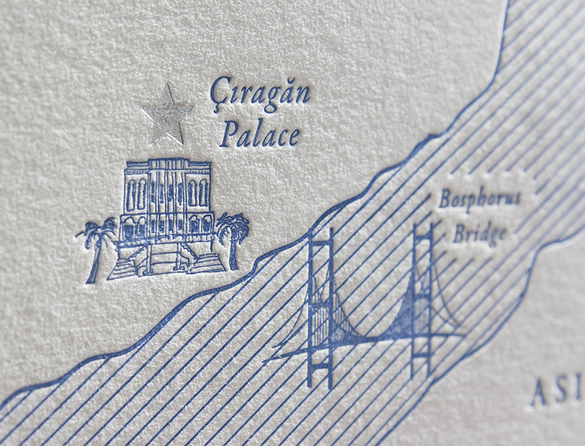
ciragan compass map mapdetails

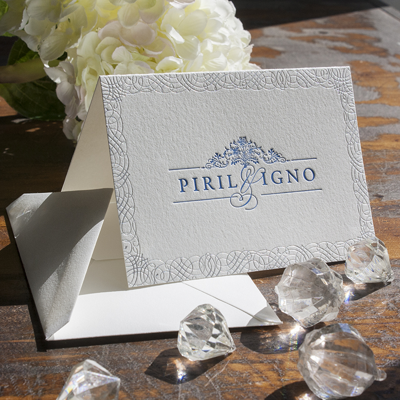
The entire suite would be printed in two groups: English for Igno and Turkish for Piril. It was a major event making sure we had the quantities and plates perfected for each language before printing! After the wedding suite was complete, we created personal stationery—again in Delft blue, periwinkle and silver foil letterpress.
stationery

I’ll never forget the experience of working with Piril and Igno across the globe to create our most lavish invitation suite to date. Click here to see a sneak peek of their wedding photos by Smallpigart. I only wish I could’ve seen it all in person!

At Home is Here!

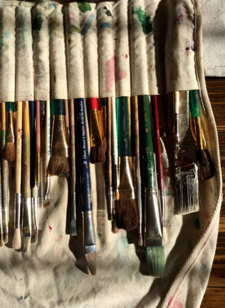
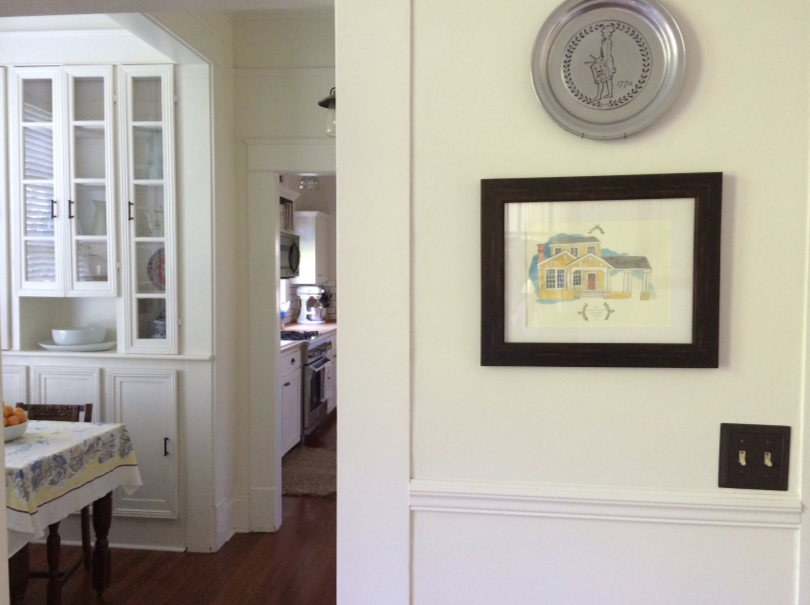
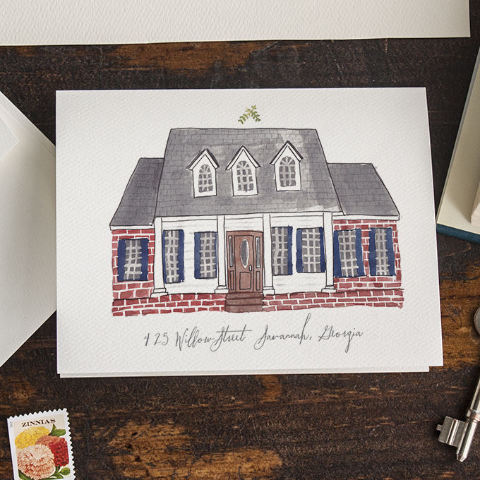
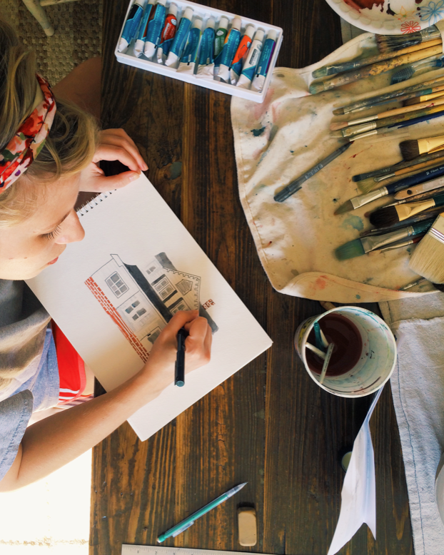
I was inspired by the artwork of Rebekka Seale back in 2012 when we moved into our house. I contacted her about commissioning one of her quirky little house portraits, but felt deflated when I learned there was a 6 month wait. I figured, “I have a degree in fine art. Surely I can make something cool.”  I got out my watercolor paints and the old paintbrush set that Ben gave me as a sort of poor boy’s betrothal in the early months of our relationship.

Screen shot 2014-05-25 at 11.40.30 PM

It’s now been a couple of years, and people still ask me about that portrait when they see it in our dining room.

Screen shot 2014-06-11 at 9.02.59 AM

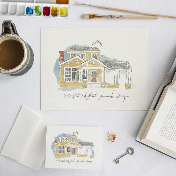
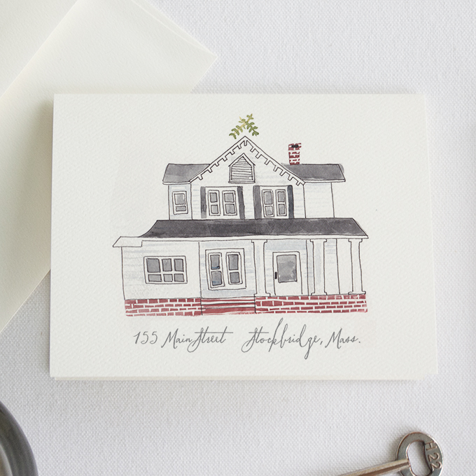
Recently, I made some notecards of the house and then my best friend, Mallorie requested some of hers, too. I referred her to Rebekka, but found that she’s completely retired from illustrating in pursuit of her new business, Camellia Fiber Co. I reached out to her to first get her blessing, and I was tickled to learn that she’s such an incredibly warm and friendly person. She was excited for us and gave her full approval, essentially passing the torch on quirky house paintings. So now, we’re happy to pick up where she left off with our newest stationery line, At Home. When you order, you receive an 8.5 x 11 print of your house along with the notecards, all on heavy watercolor paper.

Print_Stationery_525 726 425

Screen shot 2014-05-25 at 11.35.08 PM

Follow @luckyluxecouture and @southernweddings on instagram to join in on the At Home promotional giveaway that’s happening for 2 weeks this month!

Introducing John Walker Rasberry

My brother and his wife have been put through the ringer in the process of adopting a newborn over the last 6 months. For years our family prayed for a baby for them, and in November he was finally born. They were the first to hold him in the hospital, the first to give him a bottle, the first to rock him to sleep. They brought him home a few days after he was born, but they couldn’t call him their son until all the legal red tape and due process were taken care of. There were a lot of rocky moments when it looked like the birth parents were going to call it off, when we thought they would not be signing the papers. It was the hardest time our family has ever been through. But on April 10, his adoption was finalized and we’ve all been able to rest in knowing he’s ours forevermore. I wrote the story of it all over on Make Something Good Today, if you’d like to hear the heartbreaking and beautiful steps along the way to bring Walker home.

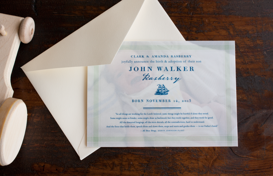
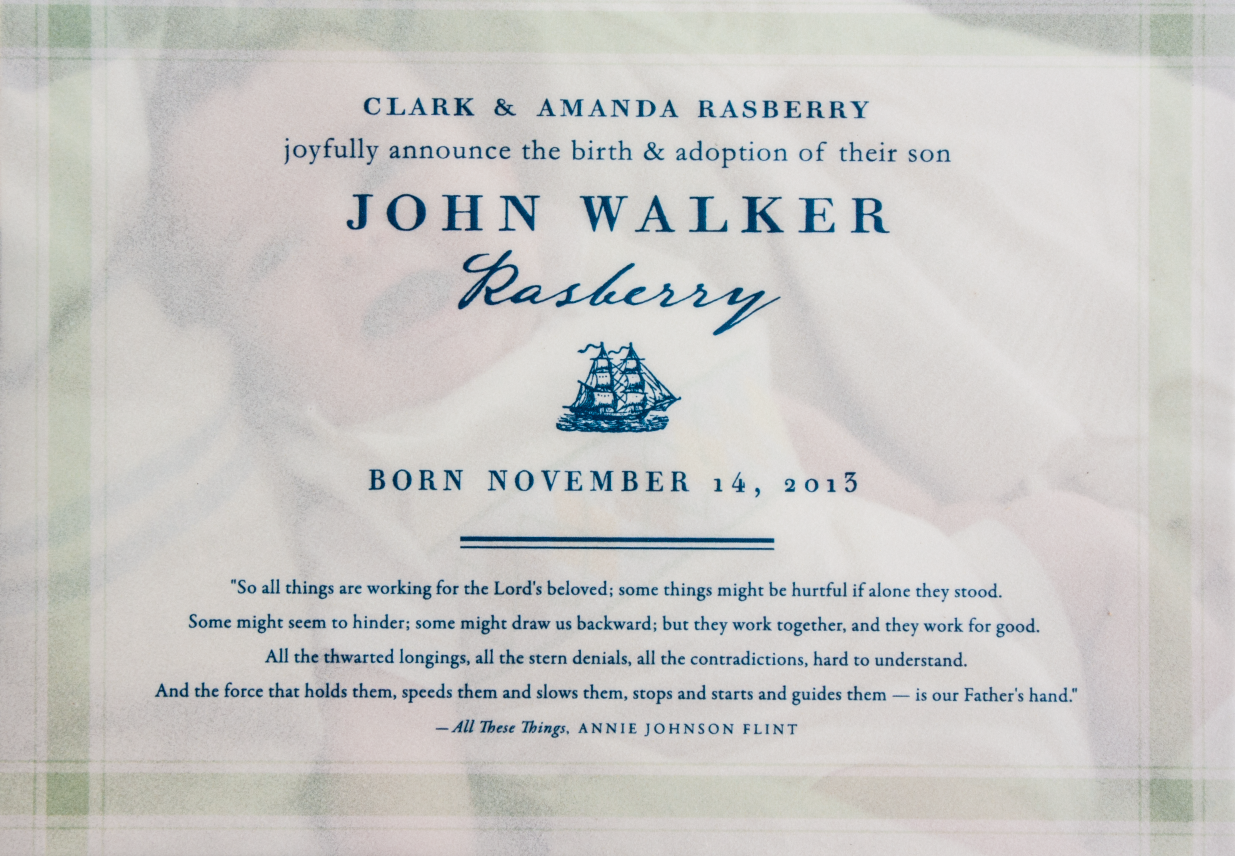
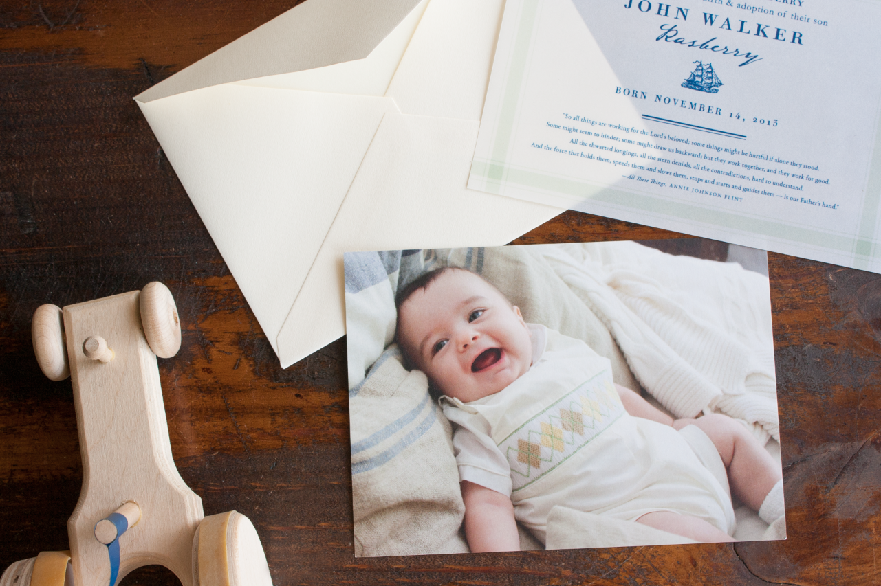
And so, now I’d like to introduce to you—my godson and nephew, John Walker Rasberry. I typically don’t love photo announcements because it leaves so little room for the informational text, so I thought one way we could handle that is by flatprinting the design on vellum, and using it as an overlay on the photo of Walker. The excerpt printed on the cards was a providential comfort in the turmoil of the adoption process—as I read it from my favorite daily devotional, Streams in the Desert, the night before the court date we’d all been preparing for and worrying over.

Screen Shot 2014-05-06 at 4.32.31 PMScreen Shot 2014-05-06 at 4.33.54 PM

Screen Shot 2014-05-06 at 4.38.48 PM

And now this has me thinking about developing a sister brand to Lucky Luxe for baby announcements and party invitations that we would call Little Luxe. What do you think? It would take a lot of design consideration and time to organize—but I think we’re going to do it. Stay tuned!