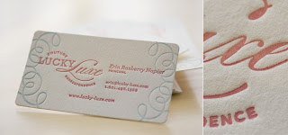
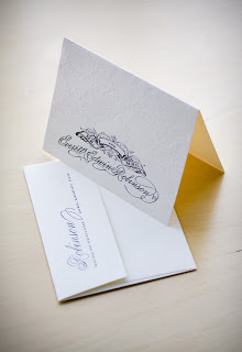
I’m excited to introduce my readers to Lucky Luxe’s newest service – print-at-home packages and pricing. Our penny-pinchers deserve beautiful design too! By going this route, you can purchase a high-resolution, custom designed invitation for printing at home. In the coming weeks and months, I’ll be establishing a ready-made collection with new pricing and a new catalog. For now, here’s the pricing guide for print-at-home designs. Keep checking in!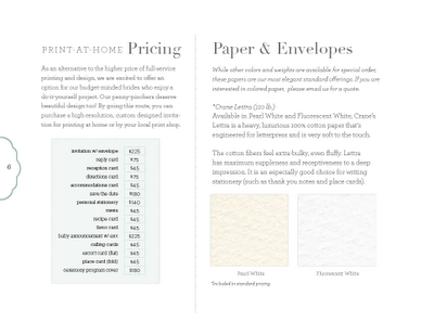
Mallorie & Jim — sneak peak!
This bride and groom are near and dear to my heart for sure, so I would love to give my readers a little background about this precious couple. The groom, Jim, is my first cousin (a financial advisor and restauranteur), and the bride, Mallorie, my college roommate (an accountant with amazing interior design and fashion sense).
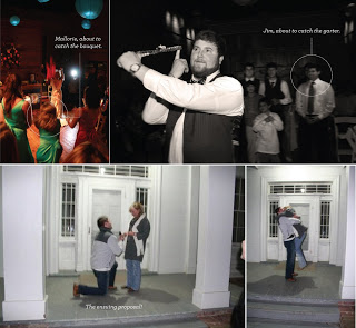
They met at my senior BFA thesis in my last week of college (an advertising campaign for Jim’s restaurant, The Reserve), and were engaged one year later on the night of my wedding:
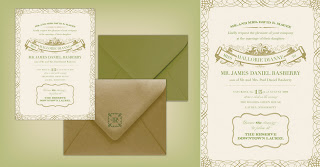
I couldn’t wait to get started designing their suite (it’s the first thing I thought of after “OHMYGOSH LOOK AT THAT RING!”). Because of their very cultured tastes and financial background (not only their careers, but Jim’s restaurant is housed in the historical former First National Bank in our town), I was inclined to give the invitation a vintage stock certificate look, complete with gilded gold ink for the flourishes and olive for the text. The ceremony will take place in a garden beside an old plantation style home in our hometown, and in a nod to the couple’s love for the Big Easy, a New Orleans jazz trio will be performing. For that reason, Mallorie asked if it would be possible to subtly incorporate a fleur de lis in the design (look closely!)
Check back later for more images of their final suite!
Nate & Gill
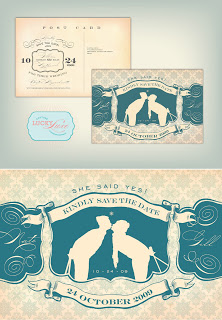
Here is another fun save-the-date postcard, this time for a couple who met on their college snow skiing team. Gillian, the bride, and Sarah of True Event are planning a subtly vintage-ski themed wedding to take place in Boston this coming fall. I can’t wait to see what we will come up with for their invitation suite. Stay tuned!
Bienvenue!
I’m sorry for the delinquent posting! It’s been crazy in the Lucky Luxe world lately, and I somehow always manage to neglect the one thing that brings in traffic.I’m going to start doing better (I hope!) Incidentally, I am working on a brand new website with all of the ready-made stationery suite options as well as custom offerings, so hopefully you’ll have a new place to visit for Lucky loot.
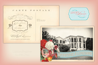
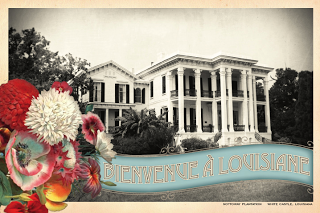
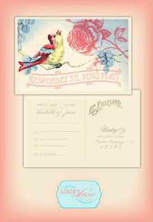
Today’s post is the Eilleen postcard, a save-the-date for a destination wedding in Louisiana. Eilleen and Trey met in the Cayman Islands, moved to Texas, and are celebrating their nuptials with fabulous Marie Antionette-ish French flair. There is a reason people love this theme — was there ever a better color combo than pink and aqua? I think not.
Business hankies!
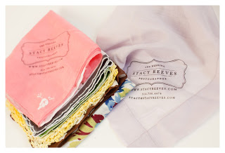
When the extremely talented Dallas-based wedding photographer, Stacy Reeves, contacted me about purchasing business “card” hankies, I was thrilled by the possibility… I mean, can you imagine being a prospective client and taking home one of these precious momentos? You can feel the past lives of each little piece of cloth, imagine the tears they’ve dried, and feel connected to others’ histories of love and joy. Thank you so much Stacy, for the wonderful photo. And I certainly won’t take credit for the fantastic branding – that design belongs to Ashley Jankowski of For the Love of Creating and the new design boutique Luxecetera.
The Gatsby postcard
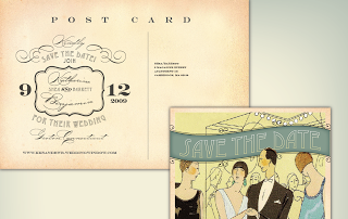
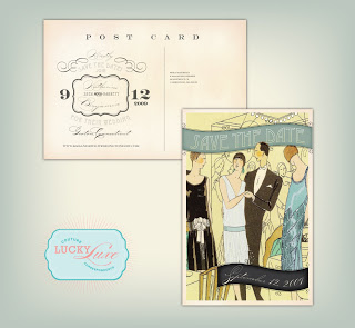
Today’s post features the vintage postcard designed for Katie and Ben’s upcoming wedding at a mansion on the shore in Connecticut. Since it will be an outdoor affair under a tent, Katie asked me to evoke a glamorous Gatsby-esqu fete. Her color palette of washed out turquoise, ink, and sunny yellow is perfectly refreshing together.
Kelsey/Roberts wedding
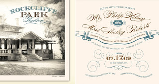
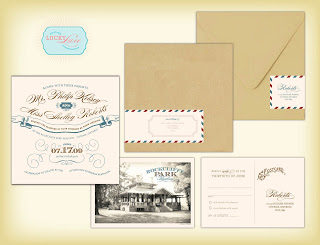
Today’s post is the invitation suite for Shelley and Philip, a very cool couple from Ontario who were looking for a design that echoes their venue – vintage mariner, nautical (but not kitschy). Their color palette is fabulous – cool greyish blue, pomegranate, mustard and brown. I am especially excited about the airmail pattern around the mailing label, and I’m looking forward to seeing how it prints. I wish I could see this wedding in person because these two have oodles of style. What a fun couple!

